The machines are starting to outsmart us. They can already pick future capital growth locations with greater accuracy than many high-profile industry experts – and we’ve only just fed the machines their entrée.
But to look forward, first we must look back. In 2012 plenty of investors and even some industry professionals were predicting that Brisbane would have the strongest growth out of all the capital cities in Australia. It didn’t happen. So market commentators rolled their predictions into the next year.
By 2014, the experts were already claiming that prices in Sydney were way too high, especially compared to those in Brisbane. Developers jumped on board trying to lure investors to
Brisbane to swallow their idle stock.
In 2015 and 2016 it was all the same noise but a lot louder – and now they’ve included Melbourne in the list of now ‘overpriced’ cities (see Chart 1, p39).
The growth in Sydney over the five years ending March 2017 was about 70%. This represents a compound annual growth rate of over 11% per annum for five years in a row! The compound annual growth rate for Brisbane for the same five-year period was only 2.3% per annum.
Eventually, those who bought in Brisbane will get some above average growth. And there’ll be a time in the future when the growth rate will even outperform the rest of the country’s capital cities. More on when that might be a bit later. But for the last five years the choice of Brisbane over Sydney has been a costly mistake. You may have thought Sydney property was overpriced compared to Brisbane’s five years ago. But looking back, would you prefer to be right or rich?
How valuable is data?
Would access to the right kind of data in 2012 have steered investors to Sydney instead of Brisbane, and how valuable would that data have been?
An investor who bought a $500,000 property in Brisbane in early 2012 would now be valuing that property at just over $560,000. If that investor had bought a $500,000 property in Sydney instead of Brisbane, their Sydney property would now be worth about $850,000.
The opportunity cost of picking Brisbane instead of Sydney was roughly $300,000 for a $500,000 investment. I would gladly pay $3,000 to have the kind of data that could earn me $300,000 over the next five years. But is that kind of data really available?
Firstly, any business that makes its money from you buying in a specific location or, even worse, buying in a specific development project, will present a biased opinion.
"The opportunity cost of picking Brisbane instead of Sydney was roughly $300,000 for a $500,000 investment"
You can combat these biases with data provided by a source that makes money from selling information, not selling property. Because data providers use computers to calculate each statistic consistently for all property markets, there is no bias.
The second issue is getting the right kind of metrics. You may have an advisor with good intentions, like your mum, but can they provide you with the right kind of information to make a good decision?
Knowing what info to ignore and what to focus on is crucial. For example, sometimes following high population growth can lead you into markets with oversupply problems. As a strategy, chasing the high-income earners can work in some cases, and in other cases it’s useless. Not all data is created equal.
So what are the key indicators investors should be looking for to maximise capital growth potential?
Finding future growth locations
Predicting capital growth is actually a simple concept: it’s all about supply and demand. If demand exceeds supply, then prices rise. So supply is the property investor’s enemy, and demand is our friend.
It sounds simple in theory. But coming up with precise measures for supply and demand is the tricky part. Fortunately, there are some indicators investors can use to get a pretty good idea of the state of supply and demand for almost any Australian property market.
Demand and supply indicators
Following is a list of some simple stats that can be used to gauge supply and demand in a property market. Read them the right way and you can easily see if demand exceeds supply in a suburb.
1. Days on market (DOM): The number of days on market is a count of the days it takes for a property to sell after being listed for sale. When demand exceeds supply, tardy buyers miss out, as the DOM gets very short in these markets. You want to target suburbs with the lowest DOM.
"Not all data is created equal. So what are the key indicators investors should be looking for to maximise capital growth potential?"
2. Discount is the amount by which a property is discounted before it gets a sale. When demand exceeds supply, the discount gets smaller and can even be a negative figure if buyers offer above the asking price.
3. The auction clearance rate (ACR) is the percentage of properties that go to auction and actually sell at auction. When demand exceeds supply of properties, many buyers outbid each other and there is usually a sale. Good investment markets have higher ACR figures.
4. Proportion of renters is the number of renters in a suburb as a proportion of the total number of occupants. This indicates the potential for supply of properties from competing landlords. The lower the proportion of renters, the fewer the number of landlords an investor will have to compete with.
5. The vacancy rate is a measure of how many rental properties are currently vacant. When demand for rental accommodation exceeds supply, the vacancy rate gets very low as lots of renters scramble over each other to get the few rentals available.
6. Yield is a reflection of prolonged periods of low vacancy rates. Demand from tenants over time pushes up rents in tight rental markets.
7. The percentage of stock on market is a direct reflection of the supply. If there are 1,000 houses and 10 of them are currently for sale, then the percentage of stock on market is 1%. When demand exceeds supply, this figure falls even lower than 1%.
8.Online search interest(OSI) is the number of peoplesearching for property online compared to the number of properties available. When demand exceeds supply, this figure gets quite large.
There are plenty more indicators investors can use, such as ripple effect potential; market cycle timing; unit to house value ratios; neighbour price balancing; long-term compound annual growth rate, and more. But let’s keep things simple for now.
Unfortunately, you’ll never find a single suburb with a perfect set of indicators. I’ve been looking at this kind of data for over seven years and have never seen it. I combine all the indicators, like days on market and vacancy rate, into a single figure I call the Demand to Supply Ratio, or DSR for short. This makes it easy to get a very quick idea of the nature of supply and demand in a property market.
The DSR is a score out of 100. The higher the demand is relative to supply, the higher the DSR. So if a market has a high auction clearance rate and a low discount figure and a bunch of other encouraging statistics, the DSR will be high. This gives a very quick gauge of a suburb’s immediate growth potential. At the time of writing, the highest DSR for any market in the countrywas 81. The worst DSR was only 28 and the average was 56.
City comparisons
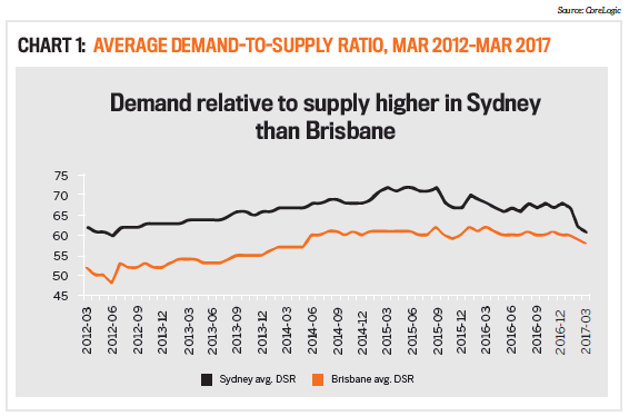
Let’s assess each city based on these combined statistics – based on the DSR. Chart 1 above shows the average DSR for all Sydney suburbs from early 2012 to early 2017. The chart also shows the average DSR for Brisbane.
As you can see, Sydney’s demand has exceeded supply by a greater degree than Brisbane’s for the entire five-year period. Looking at these two lines on Chart 1, you would have had every reason to choose Sydney instead of Brisbane in early 2012.
Recently there has been a move down in Sydney’s DSR. It’s nearly at a point you could call ‘balanced’. Theoretically, growth should slow to rates similar to those of Brisbane when the two cities’ DSR lines meet.
Which city will boom next?
The DSR can give us insights on the next city to shine. But keep in mind that a city will contain many markets, and some will be better than others. Those suburbs will change over time as their relative supply and demand situations fluctuate.
A high DSR right now doesn’t mean that the market will forever have above-average growth. Sooner or later supply catches up with demand – and sometimes can exceed it. But as you can see in the case of Sydney, rebalance can take years. Chart 2 (overleaf) shows three DSR figures for each state capital as at the end of March 2017:
1. The maximum DSR for any suburb in the city (at the top of each vertical line)
2. The average DSR for all suburbs in the city (the orange square in the middle of each vertical line)
3. The minimum DSR for any suburb in the city (at the bottom of each vertical line)
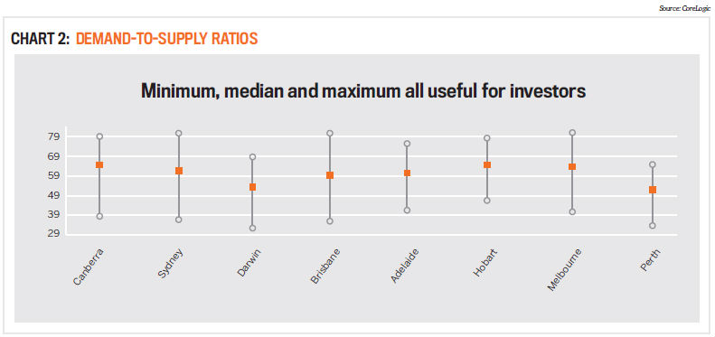
Note that the average is great for supporting arguments about which city will have the most growth next year. Looking at Chart 2 we’d say that Canberra and Hobart would outperform Sydney and Brisbane in the short term. It also suggests that Perth and Darwin may not be at the bottom quite yet.
But as investors we can’t buy an index in a city. We can only buy one property in one suburb. So the key figure in the chart for investors is the maximum, not the average. We want the best market, not the average. This would suggest that Brisbane, Sydney and Melbourne all have equally good opportunities, even better than Hobart and Canberra.
More data, more data
Note that this DSR scoring technology is only considering eight indicators, and there are a lot more variables that affect property price movements than these eight alone.
The good thing is you can find a lot of these statistics online to check a suburb’s chance of meeting your growth expectations, and using something like the DSR can give you a very good measure in only a minute.
Please don’t go out investing purely based on these stats.
"Knowing what info to ignore … is crucial. For example, sometimes following high population growth can lead you into markets with oversupply problems"
They’re meant to be a starting point, a means of filtering out all the no-go zones and zeroing in on those with the most potential. Always check that the metrics stack up to your personal observations before going any further.
After you’ve found a great market based on the stats, you then need to narrow down to a street and then a property. There is still a lot of legwork – but at least if you target high-DSR markets, you’re researching in the ballpark. Property investors have access to objective, consistent and reliable numerical and scientific methods for identifying capital growth potential, and picking capital growth hotspots is fast becoming an exercise in mathematical probability. In the next few years, we’ll see fewer and fewer opinions and more and more data dictating our decisions.
Jeremy Shep pard is the director
of research at Empower Wealth
and creator of DSR Data.
While due care is taken, the viewpoints expressed by contributors do not necessarily reflect the opinions of Your Investment Property.