The longer the timeframe, the more likely all property markets will perform pretty much the same.
Imagine you walked into a fruit shop 100 years ago.
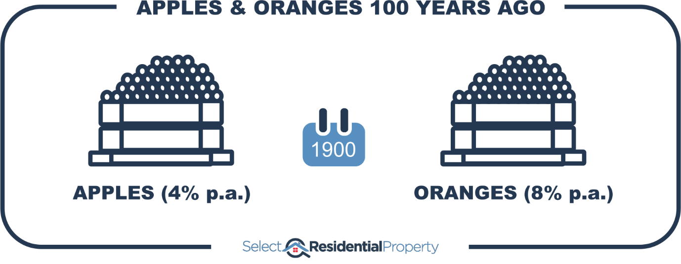
You saw a crate of apples and a crate of oranges side by side. Apples back then were 1c each while oranges were 2c.
If oranges had an 8% per annum growth rate while apples only had 4% per annum growth, then 100 years later a single apple would cost 50c while a single orange would cost $44.
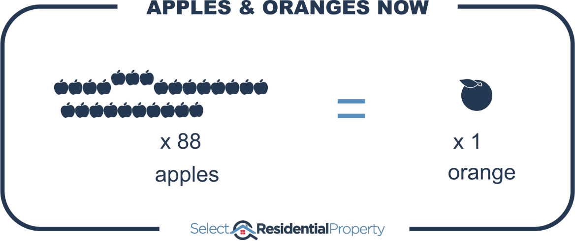
In other words, you could buy a whole box of apples for the price of a single orange.
Picture it
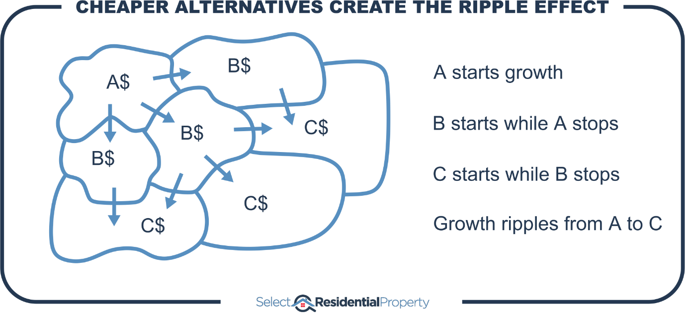
Long before prices for oranges got that ridiculous, people would stop buying them. That would not only reduce demand for oranges and therefore slow their growth rate, but it would also increase demand for apples and accelerate their growth rate.
Fruit vs. Property
Now change the following:
- Fruit shop à street
- Apple à property A
- 1c à $100
- Orange à property B
- 2c à $200
In 100 years in the same street, you’d have one property worth $5k and another worth $440k. It’s the same concept, no property buyer could justify the massive price difference.
Exponential growth
Compound growth creates a bigger and bigger margin between property markets. Eventually that margin gets so big that the price difference can’t be justified.
Eventually, all the benefits of living in a suburb are balanced out by the higher prices of properties in that suburb. It used to look like good value for money. But eventually it balances out.
Ripple effect
We see this time and time again in the ripple effect. Once prices seem too excessive, buyers start looking for cheaper nearby alternatives.
Growth probabilities
Here’s another way of looking at it. The following chart shows data from the last 40 years of house prices across Australia.
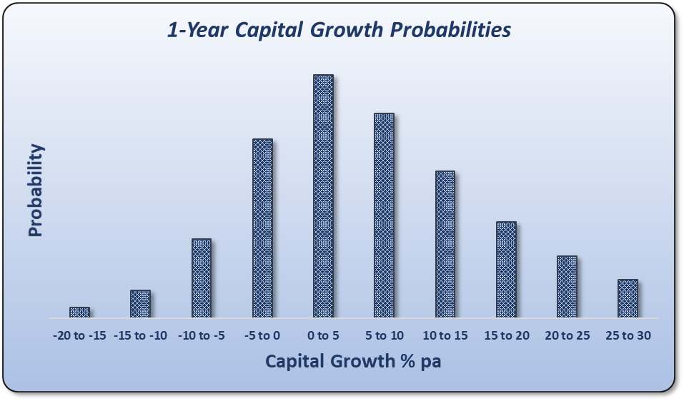
Capital growth has been split into 10 groups. If a suburb had a single year of growth at any time in the last 40 years between 0% and 5%, it would be counted in the tallest middle column. This is the most likely, most probable growth.
But there are less-common cases. Some unfortunate owners have had -20% growth in a single year. But these cases are rare (edge cases), that’s why it’s the shortest column on the far left.
Here’s the same chart but for 32-year growth instead of 1-year.
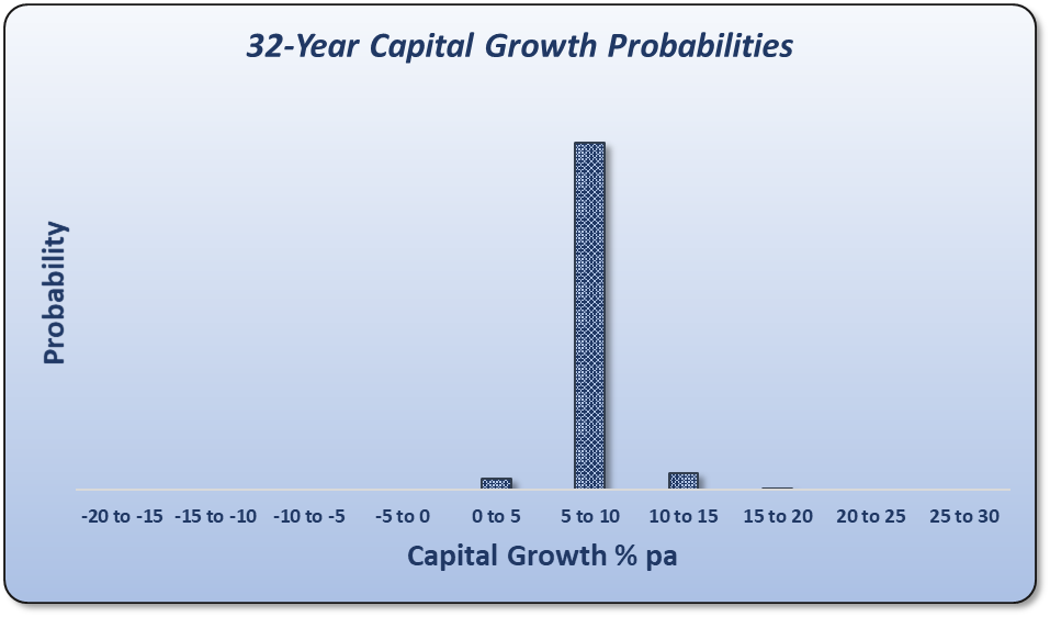
What these charts are saying:
“Long-term, there’s a tendency for all property markets to end up with the same growth rate”.
Now you might argue that you only need 0.5% better growth over the long-term to be way better off. That’s true and there are plenty of charts I’ve seen over the years like this next one:
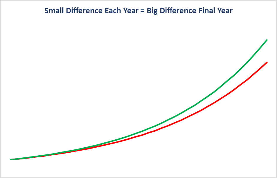
Growth like this has never happened. The above chart is completely fictitious. Not a single property market has followed those growth curves. A much more typical growth curve looks like this next one:
There are surges and sloughs and everything in between. Over multiple decades, there will be multiple cycles and nothing consistent and smooth about any of it.
There is no logic or data to suggest that a property market will outperform over the long-term. However, …
New amenities
New amenities may come to a market like a business park, train station, shops or schools. This results in an accelerated rate of growth as the suburb becomes more appealing to buyers. But once prices have factored in these new amenities, growth continues on a much more subdued path.
Only if a suburb can continually acquire new amenities will it continue to outperform the long-term average.
Conclusion
Because of the nature of compound growth, no property can continually outperform another. Eventually the price difference becomes so extreme, buyers look for cheaper alternatives. The data suggests that over time, all properties, all suburbs and even all cities, tend towards having the same compound annual growth rate.
Trying to pick a true long-term outperformer is statistically improbable, but not impossible. To do it, you need to pick suburbs that will undergo a large number of continuous positive changes over a long time-frame. Rather than guess, I go for short-term predictions - something I do know.
....................................................................................
 Jeremy Sheppard is head of research at DSRdata.com.au.
DSR data can be found on the YIP Top suburbs page.
Click Here to read more Expert Advice articles by Jeremy Sheppard
Disclaimer: while due care is taken, the viewpoints expressed by contributors do not necessarily reflect the opinions of Your Investment Property.