Introduction
Many investors believe that buying close to certain amenities will produce better capital growth:
- Transport
- Shops
- Schools
- Parks
- Etc.
In the vast majority of cases, proximity to amenities has no impact on future capital growth, especially long-term.
Superior growth doesn’t last forever
Imagine 100 years ago you walk into a fruit shop and see a crate or apples for 1c each and right next to them, a crate of oranges for 2c each.
Let’s say the price of oranges grew at 8% each year while apples grew at only 4%. After 100 years an apple would cost 50c and an orange would cost $44. You could buy 88 apples for the price of a single orange!
Obviously, that would never happen. Long before oranges got stupidly expensive, fruit shoppers would look for cheaper alternatives – like apples. That would decrease demand for oranges, lowering their growth rate. And it would increase demand for apples, raising their growth rate. Apples would catch up to oranges restoring the price difference in percentage terms.
Long-term a property at the good end of a street cannot outperform the property at the bad end. Eventually, the price difference becomes absurd and buyers simply cannot justify it.
Historical data suggests there is a tendency for all properties, suburbs and cities to grow at the same rate over the long term. Properties near shops, schools, transport nodes and parks can’t continue to outperform.
However, there is one case when amenity proximity is worth considering…
A new amenity
The introduction of a new amenity could result in an accelerated rate of growth. But that high growth rate won’t last forever. Each year, the price gap between an underperformer and an outperformer widens.
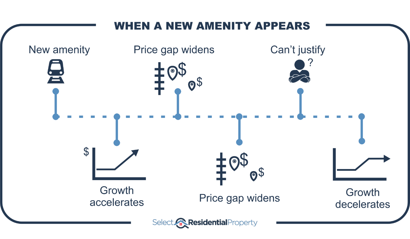
Eventually, buyers consider the price difference too great. At this point, the benefit of proximity to favourable amenities will become fully factored into the price of properties and the growth rate subdues, reverting back to business-as-usual.
The benefit of proximity to a new amenity is eventually factored into prices
Difference isn’t growth
Investors (and even experts) make the mistake of assuming that a big price “difference” was the result of capital growth difference in the past.
For example, a property within walking distance of the train station may be more expensive than one in the same suburb but further away. So, they think it will outperform over the long-term. But price difference does not equal future growth difference.
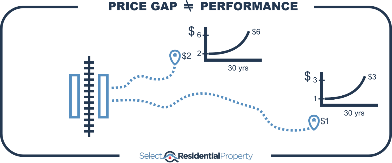
Both properties can have exactly the same growth and still maintain the percentage price difference.
Price reflects features, not growth rate. If the features have been there for ages, then they are already fully factored into prices.
Proximity to amenities is no guarantee of above average growth, even if your property is surrounded by a set of the best amenities a suburb can have.
Train stations
Following is a map of the Sydney train network.
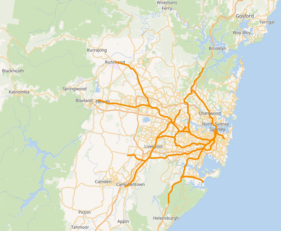
The train lines are shown in thick dark orange. The white areas are residential areas – where people live. As you can see parts of Sydney are well serviced and other parts aren’t.
The majority of train stations in the Sydney network have been around for about a hundred years. This makes it easy to see if they have outperformed long-term. I have property data dating back about 30 years. That means in most cases the train stations have already been there for about 70 years. That’s plenty of time for the benefit of that train station to be well and truly factored into the price of properties in suburbs with train stations.
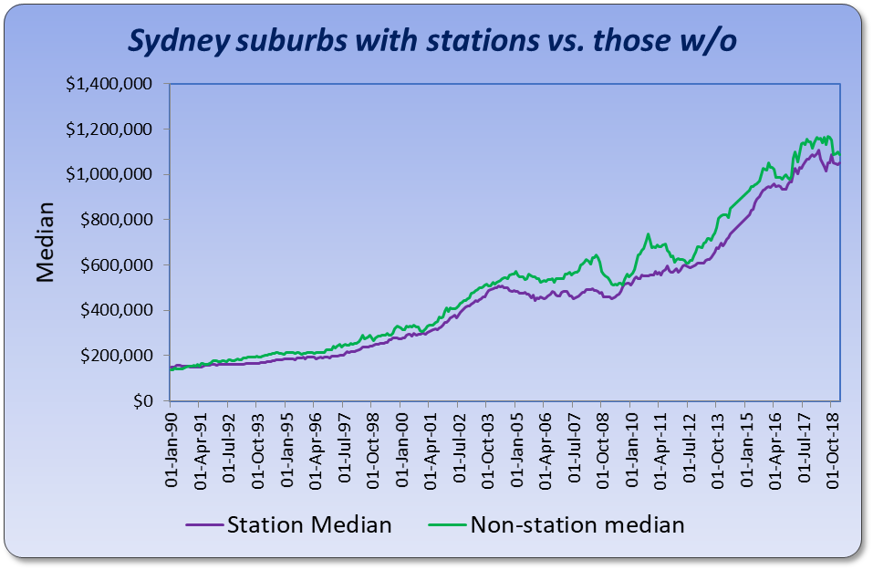
The purple line on this chart shows the change in the combined value of suburbs in Sydney that have a train station and have had one for more than 30 years. I’ve eliminated relatively new train stations.
The green line shows the growth in all the other suburbs in Sydney. As you can see the long-term growth has been pretty much the same for both stationed suburbs and un-stationed suburbs.
Melbourne
Perhaps this phenomenon is unique to Sydney. Let’s examine Melbourne’s rail network.
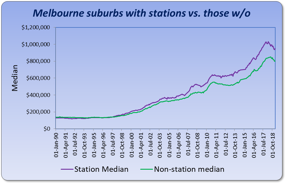
Here we see that suburbs with stations, have outperformed suburbs without stations. The difference in growth rates over this 30-year period works out to be 0.3% per annum.
There’s one data set supporting my argument and one refuting it.
Brisbane
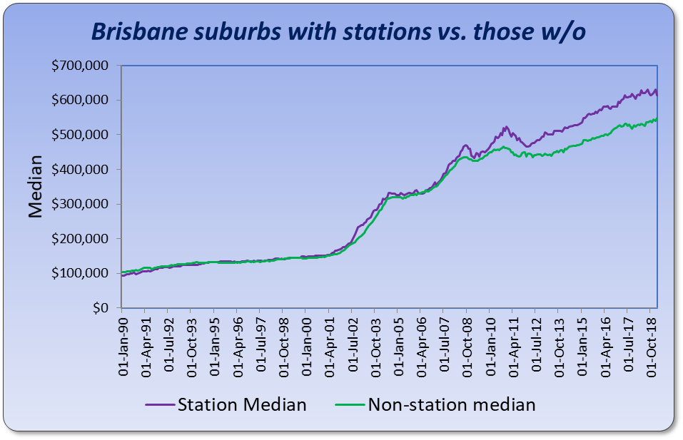
Brisbane’s chart shows the growth in train station suburbs matches the growth rate of suburbs without train stations for all but the last half a dozen years. It’s too early to tell if the last few years have started a trend that is set to continue or whether balance between these two markets will be restored again over coming years.
Train station analysis has proven to be inconclusive at this stage. Let’s look at other amenities.
Schools
One thing Melbourne is well known for is the premium commanded by houses in close proximity to good schools. The next chart shows the growth in suburbs with top class schools versus suburbs without good schools.
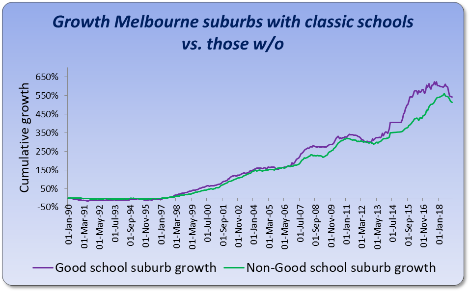
You can see that over 30 years there’s been no difference. Although both lines took different routes to get there, both have performed equally well over the last 30 years.
Imagine only looking at the section I’ve marked in red…
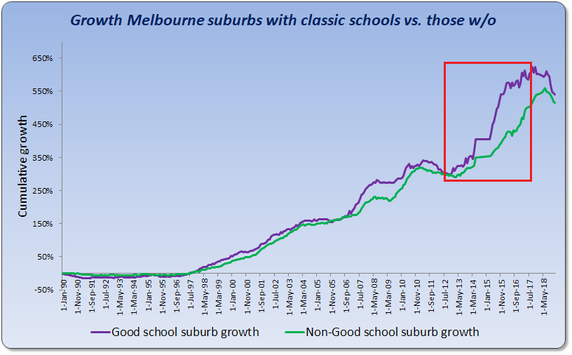
I’ve seen this come up again and again with school research. I saw one report for Brisbane public secondary schools and it was only covering a 5-year period up to 2018. A narrow view like that can lead to a misunderstanding of how capital growth works and what true impact good schools have on price growth.
The chart clearly shows that long-term there’s no difference. Being close to one of the top schools in the state doesn’t really result in better long-term growth even though it may draw a premium in property prices.
Beaches
The purple line in the next chart plots the growth in Sydney suburbs that have beaches. The green line shows the growth of the rest of Sydney.
The chart clearly shows that, long-term, neither market outperforms the other.
Shops
The purple line on this next chart shows the growth in prices of suburbs within 4km of one of the top 50 shopping centres in Australia as measured by floor space and shop count. The green line shows the growth of all other suburbs.
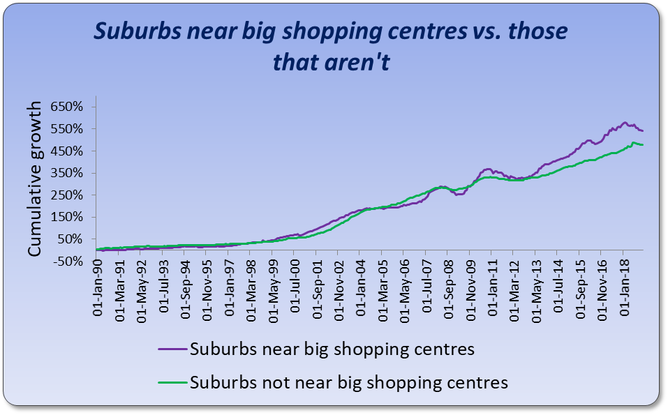
As you can see, the growth rates have been pretty much neck and neck. And the lead has swapped a few times too.
Don’t be fooled by the widest gap being at the end. It looks like there has been a change recently favouring suburbs near shopping centres. But this is a trick with compound growth. The gaps between two markets always look wider at the end. The gap in 2006 is just as significant in percentage terms as the one in 2019.
Walk score
For those of you not familiar with Walk Score, it’s a score out of 100 for the level of walkability to the most popular amenities in a suburb. The Walk Score (WS) covers all sorts of amenities like train stations, schools, shops, beaches, parks, etc. It would be an ideal measure to use. Unfortunately, WSs for Australia only date back to around 2013. This is way too recent to call long-term.
There have been plenty of studies conducted in countries that have a WS to determine price difference between high WS houses and low WS houses. Every study I’ve seen confirms there is a correlation in price difference. But again, that’s just a difference in current price. Current price difference is not a gauge of future growth potential.
And none of these studies have shown the long-term impact since the WS hasn’t been around that long. But let’s have a quick look at how high WS suburbs have performed over the short history of the WS.
The next chart compares the performance of suburbs within Sydney from late 2014 to early 2019.
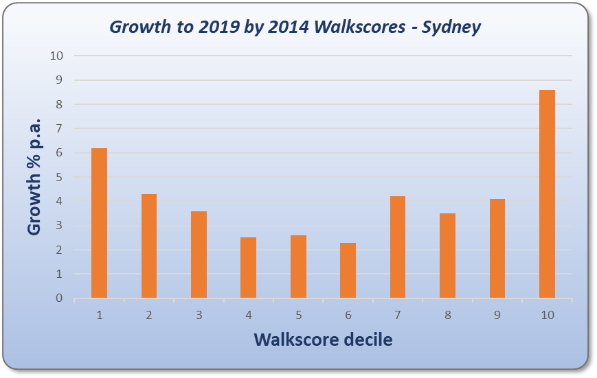
The chart splits suburbs by their WS into 10 equally sized groups called deciles. Suburbs in the top 10% by WS appear on the left of the chart. These are places like Surry Hills & Pyrmont in the Sydney CBD. The suburbs with the lowest WSs are in the tenth decile over to the right of the chart. Some of these suburbs are: Lucas Heights and Berowra Waters.
The chart says that over the short-term, in Sydney, you would have had better capital growth if you had either picked very high WS suburbs or very low ones. That contradicts the theory that proximity to amenities improves growth prospects. But it’s a short period of analysis.
Let’s look at Melbourne.
This chart shows a clear counter-correlation. The high WS suburbs are on the left and yet have had lower growth than the suburbs to the right of the chart which had higher WSs. There’s a very clear inverse correlation.
Brisbane is the same…
In fact, in Brisbane it looks like over this time-frame, if you had a lot of amenities in your suburb, you actually had negative growth.
But Perth shows the opposite correlation.
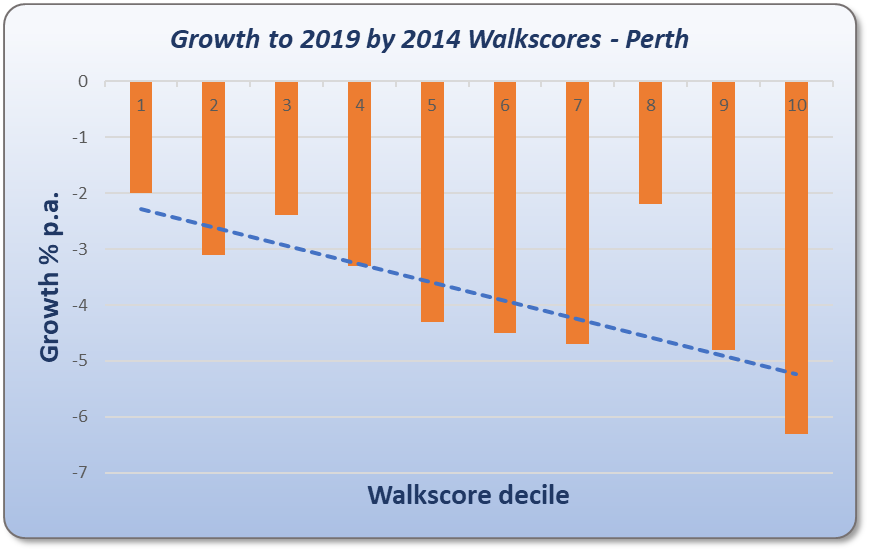
This can be a bit confusing if you follow the slope of the line of best fit. But what this chart is actually saying is that negative growth was not as negative in suburbs with higher WSs. So, this chart actually supports the notion that amenities improve growth prospects.
What about Adelaide?
Adelaide backs up Perth’s correlation, although it’s not at all convincing.
Overall, there is some evidence to suggest that amenities have been a subtractor of growth and some evidence to suggest they add to it. Overall, the WS doesn’t support the argument of buying close to amenities for higher growth.
Brisbane Airport
Airports are another amenity many point to as a growth driver. There was a study performed by Queensland University of Technology and the Air Transport Innovation Centre that examined how the opening of Brisbane’s new “international” airport in 1988 affected property prices under the flight path.
Being under the flight path is quite noisy so it’s actually a negative amenity for some Brisbane suburbs. But the report found that price growth suffered for only about 4 years. The 4 years immediately after the opening. But from then on, for the next 20+ years, growth of affected suburbs actually caught up with suburbs that were not affected by aircraft noise.
- “International” airport opened 1988
- Suburbs under flight path were affected
- Poor growth over next 4 years
- Prices caught up over next 21 years
In other words, the amenity’s introduction only affected growth rates for a short time. Long-term there was no difference.
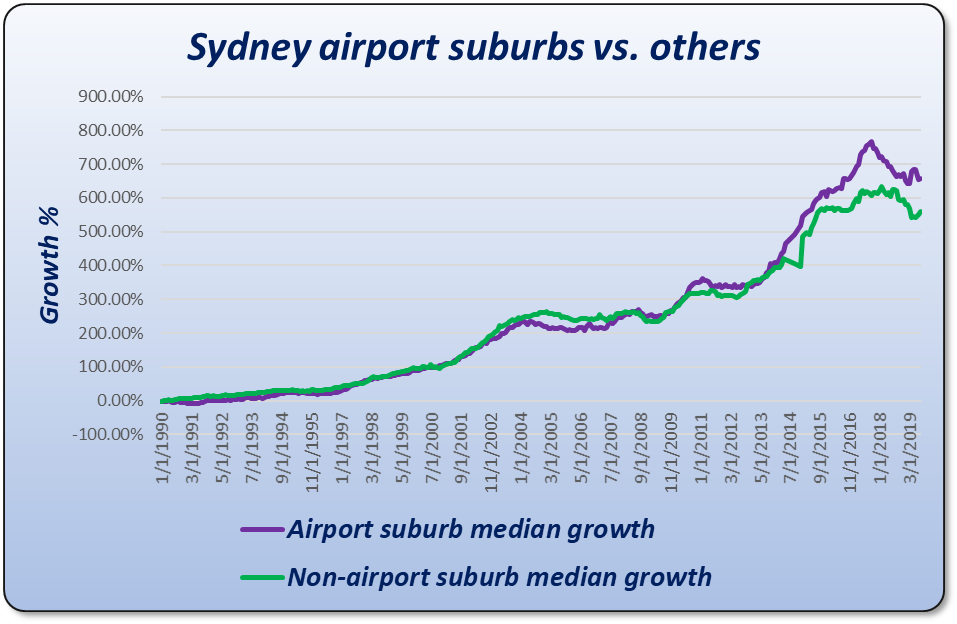
Sydney Airport
At first it might look like proximity to the airport is a long-term growth driver. But the chart shows the lead between both sets of suburbs has changed over the 30 years. They had the same growth 24 years after the start of the comparison. This once again highlights that outperformance doesn’t last long-term.
Melbourne airport
Doing the same analysis for Melbourne airport we get something interesting.
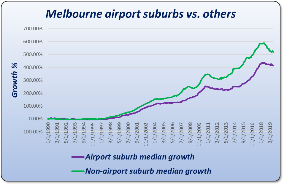
Over the last 23 years this chart suggests that buying close to Melbourne airport may not be the best investment strategy. Keep in mind that Melbourne’s airport is nestled amongst a lot of vacant land which is very different to the case in Brisbane and Sydney.
Interestingly, the new Sydney airport, to be built at Badgerys Creek, is also nestled in amongst a lot of vacant land. Over-supply can easily counter the benefits new infrastructure provides.
Price variability
If certain properties in a suburb outperform other properties in the same suburb because of their proximity to amenities, then we should see an increasing price disparity over time. Not only would the dollar gap widen, but the percentage gap in price should widen as well. But it hasn’t.
This chart shows the typical percentage price discrepancy between properties in the same suburb across over 10,000 Australian suburbs. The data covers a period of nearly 30 years and nearly a million property sales.
The chart shows that over the last 30 years the deviation in price between properties within the same suburb has actually been narrowing, not widening.
Conclusion
The ripple effect logic and historical data suggest there’s no reason to target properties near amenities for superior long-term growth. The benefit of proximity to an amenity has already been factored into prices and rents if that amenity has been there for a long time.
The full article is an even longer read but goes into a bit more detail. It is topic #4 in the Expert Busting series. More to come.
....................................................................................
 Jeremy Sheppard is head of research at DSRdata.com.au.
DSR data can be found on the YIP Top suburbs page.
Click Here to read more Expert Advice articles by Jeremy Sheppard
Disclaimer: while due care is taken, the viewpoints expressed by contributors do not necessarily reflect the opinions of Your Investment Property.