Everyone in the country seems to be aware now that the property market has well and truly ‘picked up’. But has it peaked? When will the good run end, what markets will start showing pains first, and are we looking at a bubble bursting?
Typically, the major city centres have been a herald of impending growth or gloom. In this article I’ll analyse the key indicators for the inner-city suburbs of Sydney to see if the statistics can give us an early ‘heads up’.
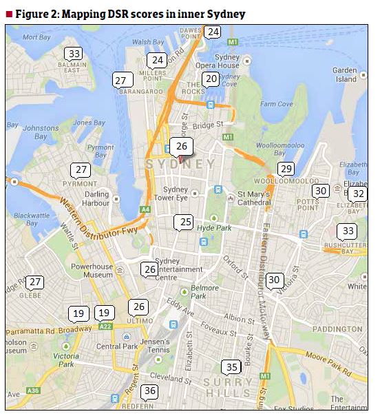
I’ve picked the top 20 innermost suburbs of Sydney. These are all within approximately 2km of the centre of Sydney. Figure 1 shows the list of suburbs, their demand to supply ratios (DSRs) and a comment about their key strengths or weaknesses.
Recap on Demand to Supply Ratio, or DSR
Prices rise when demand exceeds supply and fall when supply exceeds demand. The DSR score is a combination of a number of property price movement indicators like auction clearance rates, stock on market, vacancy rates, days on market, discounting, yield, etc. The purpose is to get an overall idea of the balance between demand and supply for a property market using a single statistic.
Clicl on the image below to enlarge

Currently, the DSR is scored out of 48. A DSR score of 0 means supply greatly exceeds demand. A score of 48 means demand greatly exceeds supply. A score of 24 is the theoretical balance point between supply and demand.
The average DSR score for Australia for February 2014 was just under 23 (out of 48). DSR scores for more suburbs can be found in the data section at the back of this magazine. Alternatively, you can view the DSR score and other statistics online at boomapp.com.au for over 10,000 property markets around the country. And it’s free.
Only three of the 20 suburbs listed in Figure 1 had a DSR score of less than 24, which is the theoretical balance point. The average DSR score for these inner-city suburbs was 27 – above the balance point. So in general we should expect to see more growth in inner Sydney property prices over 2014, albeit at moderate rates.
Possible danger areas are in the heavier unit enclaves of Broadway and Chippendale. However, these DSR scores are not ‘sell’ signals by any stretch, since they’re only just below the national average.
You’ll notice from the map in Figure 2 that the top scores were found generally in the south or east of the city fringe suburbs. This is where the predominance of units is less severe and you see more houses.
Redfern
You probably noticed that Redfern had the highest DSR score. One of its key strengths is a low average vendor discount. The discount is the percentage difference between the original asking price of a property when it is first listed for sale compared to the eventual sale price. As demand exceeds supply, the discount the seller must offer a buyer in order to get a sale becomes smaller and smaller.
Figure 3 shows the clear downward trend of discounting in Redfern units over the last 20 months.
The average discount of units sold in Redfern has halved in a little over 18 months. The minimum discount for the country for February 2014 was 1.8%. The median discount for the same period was 7.3% and the average was 7.7%. So you can see how positive the
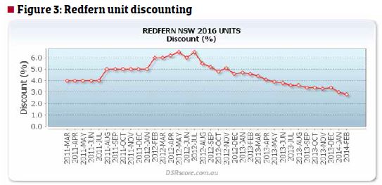
Redfern unit discount figure is. Redfern and Surry Hills are the standout opportunities for an inner Sydney investment at the moment. There is plenty of reason to believe the good run will continue with these markets.
Sydney
Figure 4 shows the DSR score over the last three years for Sydney units. Note that this is for the suburb specifically called Sydney, not the metropolitan area of Sydney.

Although there is quite a bit of volatility in the DSR scores from month to month in this market, the overall trend has been gradually upwards. However, for most of 2011 the DSR score was under 15. This is considered ‘poor’ so the market is rising from a low base.
The current DSR score of 26 is considered ‘above average’. To place this in context, see the DSR context ruler for Sydney units in Figure 5. The context ruler shows the lowest and highest DSR scores for the country for the month of February 2014 for units – 4 and 42 respectively. The ruler also shows the median DSR score for February was 25 and the average DSR score was 24.8. The context ruler places Sydney units just on the positive side of these figures.
You can also see the quartiles at the bottom of the ruler and the standard deviation limits at the top. These are where most markets’ DSR scores reside. The ruler shows that 50% of all markets Australia-wide had a DSR score somewhere between 20 and 29 (see the spans of Q2 to Q3).
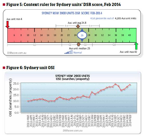
Similarly, the standard deviation limits show that the vast majority of unit markets had a DSR score between 18 and 31. What all this means is that there is nothing wrong with the Sydney unit market at the moment.
Figure 6 shows the interest of potential buyers searching online for property to buy or rent in Sydney. OSI stands for Online Search Interest. It is a ratio of the number of people searching for property compared to the number of properties available. This is a mini demand to supply ratio and is incorporated in the DSR score. The trend is unmistakably positive. Hopefully it continues. There is enough evidence from these figures to indicate that unit prices in the suburb of Sydney will continue to rise at a modest rate through 2014.
Chippendale
Figure 7 shows the DSR scores for Chippendale units. Note the trend is downwards despite the month-to-month volatility. There is no way to know if the DSR score for Chippendale units will continue to drop over 2014. However, it is interesting to contrast this slow decline in DSR against Figure 8 – the change in typical values for units in Chippendale.
In a market where demand exceeds supply there are two ways in which the demand and supply are brought back into balance. Either the supply increases or the demand subdues. One of the biggest dampeners of demand is excessive prices. The recent price rises in Chippendale units shown in Figure 8 show a wet-blanket effect on the DSR scores of Figure 7.
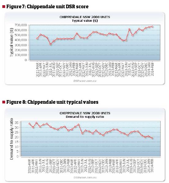
If I had to find an inner Sydney market about to experience a bubble burst, I’d put forward Chippendale units as a remote possibility. The DSR has dropped below 20 and price growth looks like it is exhausted and about to peak.
However, if I was an owner of units in Chippendale, I would not be rushing out to find a selling agent. Instead, I would be approaching my lender for a loan top-up to cash in on the recent price growth. I’d then exercise patience, waiting for the next surge in Chippendale prices, and in the meantime use that equity to buy in another location that is booming. Conclusion
If the inner-city suburbs of Sydney are a warning sign of what is to come, 2014 should not be a year of bubble-bursting for Australian real estate. There will, however, be some suburbs in inner Sydney that suffer while others surge. And those discrepancies in growth prospects are even more pronounced when comparing the many unique real estate markets spread over our vast country.
Jeremy Sheppard is an active property investor and the director of Redwerks. Jeremy is also the creator of DSRScore.com.au., which measures the capital growth potential of markets based on their demand and supply dynamics.