Where and how to find areas that will dramatically reduce your risks and maximise your profits. Jeremy Sheppard explains
We’ve all heard the old adage, “capital cities are a safer investment option”. But the statement is so broad it should immediately trigger alarm bells in the cerebral cortex of your brain. It might have been good advice at one time, but is that general rule still applicable right now?
I prefer challenging old rules rather than just blindly following them. One preference activates your mind, while the other shuts it down.
There are so many variables affecting property markets. Every case is unique and therefore requires fresh thought.
I believe that one line of wisdom is wisdom for one time. That time could be changing and soon we might need new lines of wisdom for the new times.
Are capitals safe options?
Do capital cities really offer safer investment opportunities?
Following old wisdom in a new age is going to bring investors undone. And the time for that undoing is fast approaching for one of Australia’s capital cities in particular – Sydney.
There are many investors heeding this advice to only buy in capital cities. These investors may not only miss out on better opportunities elsewhere, but in some cases they may experience negative growth.
Don’t get me wrong. At the time of writing, early February 2015, I still believe some of the best investment locations across the country are in Sydney. However, some Sydney micro-markets have hit a peak. From here, it’s either a prolonged period of no growth or even a drop in values.
Danger suburbs in the city
Not only is it misleading to say cities are always a safe investment option, but there are actually some city suburbs that are becoming dangerous.
The upper end of capital city markets, for example, is the most volatile. Business will boom and bust as the economy moves into different phases. In the past, property prices above the million-dollar mark have been targets for trouble. They’d jump from $1.5m to $2.2m in a couple of years and drop back down again a few years later.
There are also suburbs moving in and out of fashion. “Surry Hills is so 2014, what’s the new black”? A fight is going on among buyers desperate to sneak into one of these chic markets. This feeding frenzy can panic them into making uncalculated buying decisions.
Eventually, affordability flicks a light on in buyers’ minds. Almost overnight they start thinking this suburb simply isn’t worth it. Buyer sentiment can be fickle.
The biggest issue facing Sydney investors is the potential of buying at the top of the market.
So what’s an investor to do?
The means of protecting oneself from choosing such risky suburbs is actually quite easy. Here are some simple steps:
- Aim low
- Check recent growth
- Gauge value more so than sentiment
- Target ripple effect areas
Aim low: Target lower socio-economic areas, better still, aim for the middle. Definitely avoid the top end. This doesn’t guarantee a safe haven, but it avoids those markets most likely to have the biggest tumble when the wheels fall off.
Check recent growth: Obviously, if a market hasn’t had a big boom recently, it’s unlikely to be one of those markets where buyer buzz is about to bust. Have a look at a growth chart covering at least the last two years of values. If there has been a steep upwards climb in the last few years, then it’s more likely the market is reaching its peak.
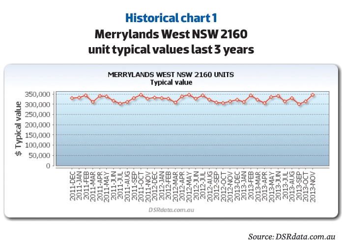
The historical chart for units in Merrylands West shows a low risk recent growth history. It’s unlikely this market is about to enter a bust period since it hasn’t had a recent boom period.
You can also see from the typical prices that this market is not in the expensive range. Units are still very affordable as far as Sydney prices go.
Merrylands West is not on the outskirts of the city, either. In fact, it is not far from the geographical centre of Sydney. This is a good middle-ring suburb to start research in.
The long-term growth can also be a good indicator. The data section in this mag can give you a rough idea of a suburb’s long, medium and recent growth. You don’t want this to be high. You actually want it to be low.
Property market cycles are not quick. Even in city locations, a market might not go through a complete cycle in 10 years. And don’t expect charts to show the stereotypical surge and sludge growth rates. Every market is unique.
Gauge sentiment stats: Sentiment is not a bad gauge of the demand for property in a market. But you need to be careful when sentiment gets carried away. Some statistics that closely reflect buyer sentiment are:
- Days on market (DOM)
- Vendor discount
- Auction clearance rate (ACR)
The DOM is a measure of the number of days a property stays listed for sale. The greater the demand from buyers, the quicker they snap up properties and the shorter the DOM.
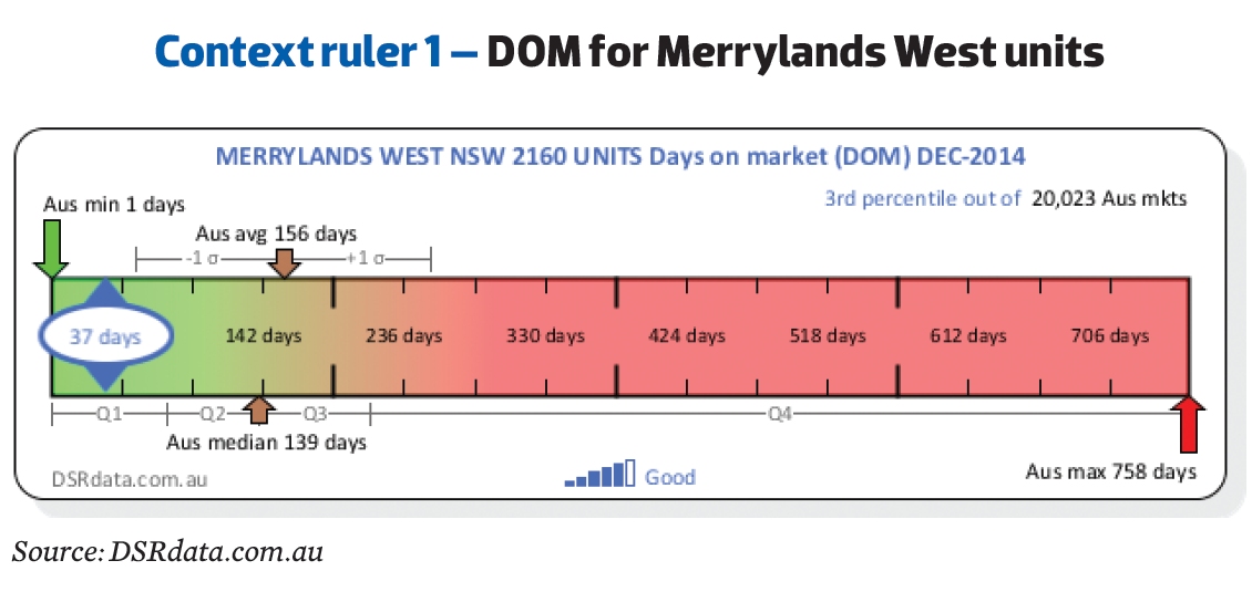
The image above called Context ruler 1 places the DOM statistic in context along a ruler so you can visually gauge where along the ruler a good value would lie versus a bad one. You can see that 37 days on market is pretty good given the average is over 150 and the median around 140.
The vendor discount is another sentiment-based statistic. The discount is the difference, in percentage terms, between the original asking price and the eventual sale price. When a market has an average vendor discount below about 5%, you know that demand is strong from buyers.
Auctions in general are recommended by real estate agents to their clients when buyer sentiment is very positive. The auction clearance rate and the percentage of sales by auction (SBA%) are good indicators of demand. But they are subject heavily to sentiment.
Look at the value stats: When looking for low risk markets, you can’t ignore the sentiment stats.
But you need to play down their role in your overall conclusion and focus more on the value-based stats. Two great value-based stats are:
- Vacancy Rates
- Yield
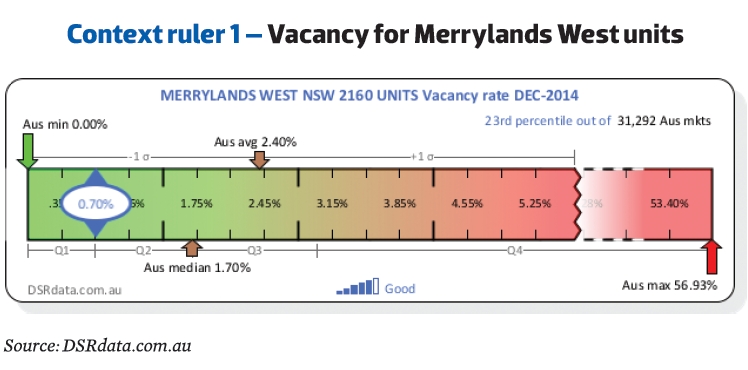
The yield in Merrylands West units is quite healthy at around 5.5%. This is above average, but it’s nothing special.
You can see more historical charts and context ruler graphics for more property markets around the country and for a host of different stats for free at DSRdata.com.au.
Target ripple effect areas: If the end of a strong growth cycle is your concern, then look for neighbouring markets into which that growth might ripple. On a city scale this might mean looking for properties further away from the CBD rather than close to it (as is so often advised).
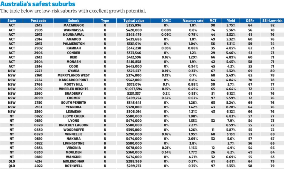
You may not be familiar with some of the stats in Table 1, so quickly let's go through them...
SSI
I use a set of indexes to score markets for various investor strategies like: cash-flow, discount, off-the-plan, buy and hold, etc. I call these indexes the Strategy Suitability Indexes (SSI).
I have an SSI that suits low risk investors called the 'SSI-Low risk'. This SSI-Low risk gives a market a score out of 100 for its potential to suit low risk investor strategies.
Certain statistics are given a higher priority in the scoring algorithm. This gears the index so it favours markets that are more likely to be low risk investment locations. This is at the expense of higher yields or rapid capital growth. The SSI-Low risk is rigged to give low risk markets the biggest score.
The statistics currently used in the SSI-Low risk include:
- Percentage stock on market (SOM%) especially land
- Vacancy rate
- Market cycle timing (MCT)
- Yield
- DSR+
These stats are explained below.
Table one contains the top picks using the low risk Strategy Suitability Index. The SSI-Low risk is scored out of 100. The higher the score is, the better the suitability of the market.
SOM%
The SOM% is Stock On Market percent. This is an indicator of the supply of property in a market. Oversupply is a big risk for investors. Supply is the enemy of growth. So you want a very low SOM% for a low risk investment suburb.
A few years ago I was asked to research the Bowen market for a developer. They were already convinced the market was a good option because of the demand created by the resources boom. But they wanted to hear it from someone else. Unfortunately, their research failed to consider the supply side of the equation.
It took only a few minutes for me to see a big red flag in massive land SOM%. I warned the developer but my advice was not heeded and they went ahead with the project. Last I heard, an investor who bought into the project was suing the developer because values had dropped so alarmingly low.
Even if the SOM% is quite low it doesn’t mean it won’t get high. There may be some new developments in the pipeline. Apart from checking the council website for development applications, you can also check the amount of vacant land for sale.
MCT
The MCT stands for market cycle timing. It is a score out of 100 for the likelihood that the current market is at the right point in its cycle for growth. This stat looks at recent growth in a special way to score markets ready to plateau lower than those just taking off.
DSR+
Long-term readers of Your Investment Property magazine will already be well aware of the DSR (Demand to Supply Ratio). It is a ball-park statistic to gauge the Demand to Supply Ratio for a property market. Prices rise when demand exceeds supply, making it of crucial consideration. Please note that the DSR is now scored out of 100 instead of 48 for greater accuracy and easier assessment of the score.
But the table actually shows the values for DSR+ instead of just the DSR. The DSR+ is the souped up version of the DSR. It includes extra statistics for greater accuracy.
Gauge risk yourself
You don’t always need my index to gauge risk potential. Consider these vital statistics for your own calculations:
- Low land supply – remember, supply is the enemy of growth
- Low stock on market percentage – ditto
- Low vacancy rate – high desirability to live in a location with low supply of accommodation
- Low recent growth – avoid buying at the peak of the market’s cycle
- High yield – indicates better value for money and at least keeps the mortgage paid
Research more than just stats
The stats are the easiest part of the research puzzle. There’s a whole lot more you can do which will be considerably time consuming. But you’ll get the best information for your efforts if your next stop is the council website.
Check the relevant council website for new developments about to come on the market. You don't want extra supply. You're looking for the least number of new developments for the area. Count the number and nature of developments. Get an idea of the number of new dwellings and their timeframe for completion.
While you’re on the council website, you can also see what their plans are for the area and how amenable in general they are to development.
Conclusion
Ignorance is risk. Not knowing what will happen to your property market in the future is a risk. Reduce your risk by knowing as much as you can about a potential market. If you've gathered 10 or more quality items of information about a location and if you interpret that information correctly, then you'll probably do better than the average investor.
Jeremy Sheppard is a property investor, creator of the Demand to Supply Ratio (DSR) and a self-confessed capital growth research 'nutjob' for DSRdata.com.au