The information age has brought about a rapid expansion in data for investors. And the number of statistics and the ability to analyse and filter them is about to explode.
Unfortunately, not everybody gets on well with numbers. If you are a technophobe or a number-hater, you could quickly be at a disadvantage if you don’t address this weak spot in your investing skill set.
Don’t fret. The following article takes a machete to the big data jungle. It won’t turn that jungle into a putting green, but it will protect the data-poor investor from being at the mercy of those in the know.
These stats are the start of a revolution in property investment research.
Supply and demand
Good capital growth and top rents both come down to supply and demand. If the demand to own property exceeds its supply, property prices rise. Similarly, if the availability of rental accommodation is scarce but renters are plentiful, then rents go up. Supply and demand dictate the price of pretty much any commodity or service in a free market.
Every bit of research property investors do should be geared towards determining the supply and demand for property.
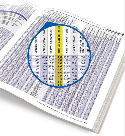
Most of the statistics that follow indicate either demand or supply or a bit of both. But before I get to those we need to cover the good old median value.
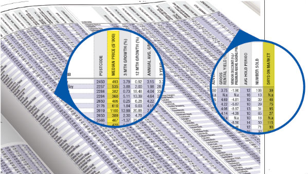
MEDIAN VALUE
The median is the middle figure. Order a list of property prices and pick the middle one – that’s the median.
For example, if there were five sales as shown below, the median would be $449,000:
• $445,000
• $447,500
• $449,000
• $481,000
• $505,000
Where can I get it?
You can get median values from the data section at the back of this magazine, and from its website YourInvestmentPropertymag.com.au. The Top Suburbs page shows median values provided by CoreLogic RP Data.
Is it reliable?
The median price for a suburb is what a buyer would usually expect to pay. However, sometimes the suburb’s mix of properties can be so diverse that there is no representative figure.
For example, in a suburb in one month there may be the sale of a brand-new three-bedroom, two-bathroom unit for $500,000. And in the same suburb and same month there may be an old one-bedroom unit with no parking space that sells for $300,000. Therefore this suburb will have a median for the month that does not represent the typical value of properties because there is no typical value.
In markets with a wide range of different property types, the median can jump up and drop down in value from month to month, depending on what happens to sell in that month. This doesn’t mean there have been wild swings in capital growth. It is just a statistical anomaly.
Whenever you’re in doubt about a volatile statistic, check a historical chart to get a better idea of the value over the last several months. Historical charts for most of the statistics mentioned in this article can be found using the free data presented in the Suburb Analyser at DSRdata.com.au. There are also charts for the median from CoreLogic RP Data on the Top Suburbs webpage at YourInvestmentPropertymag.com.au.
DAYS ON MARKET(DOM)
The days on market figure (DOM) is a count of the number of days a property will typically spend advertised for sale before eventually selling. A property is considered to be on the market as soon as the real estate agent lists the property for sale.
Once the property has sold, the agent will remove the listing from the property search website. That time period of advertising is the DOM.
In a market where demand exceeds supply, properties are snapped up quickly by eager buyers. This is because the seller is able to get the price they want without waiting very long for a willing buyer.
Where can I get it?
DOM figures for specific suburbs can be found on Your Investment Property website’s Top Suburbs page.
Is it reliable?
Generally this statistic is quite reliable. However, here are some things to watch out for:
• The agent may be tardy in removing the property from the listing website once it’s sold.
• Properties can be sold without even being listed.
• A property may be listed for some time with one agent and then the seller decides to use a different agent, and so the property is delisted and relisted.
• A sale may fall through, resulting in the relisting of a property.
What’s a good value?
As at the end of March the average DOM countrywide was 163 days, while the median was 137 days. So investors should be looking for markets with a DOM of less than about 120 days.
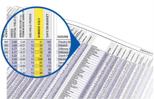
DISCOUNT
The discount is the difference between the original asking price of a property for sale and the eventual sale price. For example, if a vendor has their property listed for sale at $400,000 and then the buyer eventually pays $380,000 for the property, the vendor discount is $20,000 or 5%.
The discount represents how negotiable sellers have been on price. If a seller is struggling to get a willing buyer for their property, they’ll often consider a lower sale price.
When demand for property in an area is high and supply is low, the vendors don’t need to discount much. On the other hand, in a cool market vendors may need to offer a significant discount.
Where can I get it?
The average property discount for a suburb can be obtained from Australian Property Monitors (APM), CoreLogic RP Data, OnTheHouse.com.au and DSRdata.com.au. You can see the values provided by CoreLogic RP Data in the data section of this magazine (p113–143) and on its website at YourInvestmentPropertymag.com.au.
Is it reliable?
Depending on the marketing strategy of the selling agents, it may be hard to determine the average discount for a suburb. For example, how can the discount be calculated for a property listed for sale as “Offers above $400,000” or “Buyer range $500k to $550k”?
What’s a good value?
The current median discount countrywide is 6.9%, while the average is 7.52%. So any discount less than about 7% is a good figure currently.
AUCTION CLEARANCE RATE (ACR)
The auction clearance rate is the number of properties that sell via auction as a percentage of those that go to auction. Not every property that is placed on the market via auction sells.
If there were five properties for sale via auction and four sold, then the ACR would be 80%. That is 4 ÷ 5 x 100.
If there is strong demand for property and limited supply, buyers will bid the price up at auction. With higher price bids there is more chance that the seller will get the price they want. With more sales, there will be a higher ACR. So a high ACR represents a high demand compared to supply.
Where can I get it?
ACR figures are published by most of the major data providers. However, this is usually at the city level, which is not much help for investors who can’t buy an entire city. Suburb-level statistics can be less reliable but are more relevant.
Is it reliable?
If there is only one auction in a suburb over a month, then the ACR is highly unreliable for that month since it can only be one of two values: 100% or 0%. So the number of auctions taking place is crucial for the reliability of the ACR figure.
An example of the volatility of the ACR can be seen in Chart 1.
Chart 1 – ACR history for Ermington units
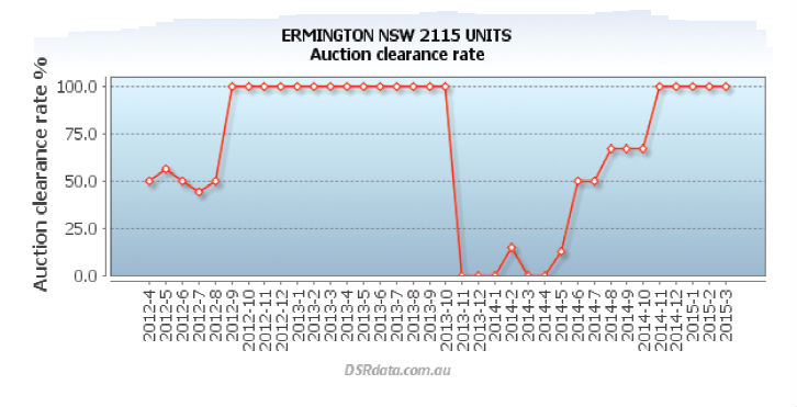
In general you should be sceptical of both 0% and 100% ACR figures until the number of auctions held can be determined. At least half a dozen auctions would be required to consider the ACR as roughly reliable.
What’s a good value?
Most people believe that an ACR of 50% is a pass mark. But the average ACR is actually lower than that. In fact, at the time of writing, the typical ACR countrywide is less than 40%. But Brisbane units have a better than average ACR of 47.5%, which is less than the 50% mark.
RENTER PROPORTION
The proportion of renters is the percentage of tenants living in a market compared to all dwellers in that market. The other obvious option is, of course, owner-occupiers. So if the suburb has a population of 1,000 and 600 people are owner-occupiers while 400 are tenants, the proportion of renters would be 40%.
In general, owner-occupiers take better care of their properties than tenants do. They are therefore more likely to improve the property beyond what makes pure commercial sense. This affinity for overcapitalisation raises the general quality of housing in an area dominated by owner-occupiers.
Also, with a low proportion of rental properties, there’s less competition if an investor plans on providing rental accommodation there. The renter proportion can be considered a current supply indicator.
Where can I get it?
This data comes from the ABS. It is based on census data. The ABS breaks the tenure type down into about eight different categories, such as:
• Renting
• Owned with mortgage
• Owned but paying mortgage
• Life tenure
• Lease to buy
Of all the people that dwell in a suburb, we can try to categorise them into two simple groups: those who are renting the home they live in and those who own the home they live in. In some markets there may be a significant number of residents that don’t fit neatly into one of these two categories.
Is it reliable?
Since the base data comes from the ABS, it is pretty reliably published. However, it relies on what the Australian public fill in on census night. The questions to do with tenancy type in the census may not be clearly understood by some.
Also, a census is only conducted once every five years. And it takes some time to acquire, filter, process and then publish the data. So it can quickly become out of date in fast-moving markets.
What’s a good figure?
About one in four renters to owner-occupiers is a good benchmark. Anything less is a better market to invest in.
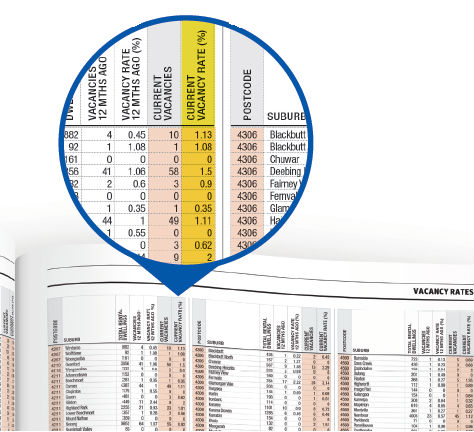
VACANCY
The vacancy rate is a measure of how many rental properties in a location are currently without a tenant. If there are 200 rental properties in a suburb and two of them are vacant, then the vacancy rate is 1%.
A low vacancy rate means good security of cash flow for investors. Sooner or later a tenant is going to move out of your investment property. The less time the property is vacant, the more money you’re making.
Vacancy rates also reflect capital growth potential. If a tenant finds a location attractive to live in, a homeowner is likely to fi nd the location attractive as well. Tenants are humans too, after all. So a low vacancy rate can also mean impending capital growth.
Getting a lease is a lot easier than getting a mortgage. And a bond is a lot less than a deposit. So tenants are more agile than homeowners and investors. If a location becomes attractive to live in, tenants will move there before homeowners. They’ll drive down vacancy rates, making the location also attractive for investors. So a low vacancy rate may actually be a lead indicator for future capital growth.
Where can I get it?
Real Estate Investar (RealEstateInvestar.com.au) publishes vacancy rates all the way down to the bedroom level. Your Investment Property publishes this data at the back of the magazine (p94–104) as well as on its website. SQM Research publishes vacancy rates on a postcode level, while the Real Estate Institute of Australia publishes this data on a quarterly basis.
You can get a rough idea of the vacancy rate by simply visiting property portal sites like Domain.com.au and RealEstate.com.au. One good thing about the vacancy rate is that it is easy to get a very recent figure. You can see properties for rent right now.
Is it reliable?
There are a number of problems in calculating an accurate vacancy rate for an isolated market. Some properties listed for rent are included in a provider’s calculations, but the advertised property might be currently occupied and available only at some future date.
What’s a good figure?
It has been a long-held belief that a 3% vacancy rate is an indicator of a market in balance. Currently, however, a more typical value would be around 2%. As an investor you would want to buy into a market with a vacancy rate comfortably below that. Anything below 1% is great.
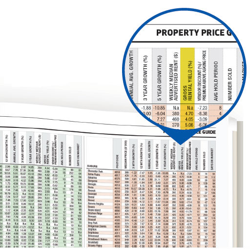
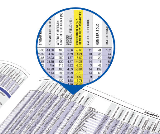
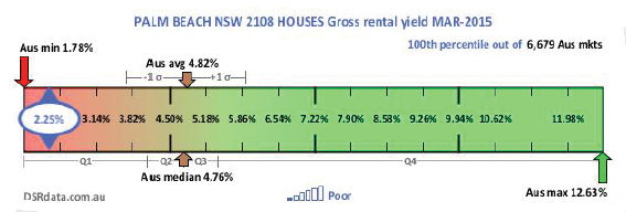
YIELD
The yield is a measure of how much rental income a property earns in one year calculated as a percentage of the property’s value.
For example, if the rent charged to live in a property is $300 per week, then per year this would be $15,600. Now if the value of the property is $400,000, then the gross rental yield would be calculated as $15,600 divided by $400,000. Multiply that by 100 to get the yield as a percentage. In this case it would be 3.9%.
A high yield means good cash flow for investors, improving their return. Good cash flow makes it easier to get loans approved to purchase more property. But a high yield can also be a precursor of capital growth.
When a location becomes attractive, renters are the first to move into it. A location may become attractive because new businesses have opened in the area, providing employment opportunities. Or perhaps a new train station has been built, or other areas have simply become too expensive.
Whatever the reason, it is the renters that are likely to get there first. They increase demand for rental accommodation, and this places pressure on rents to go up.
Investors may notice that the yield in these attractive locations is higher than in other areas. This will draw them into the market once renters have had their influence.
If renters fi nd a location attractive, it is rarely the case that owner-occupiers will not. Both demographics are human and look for similar qualities. So with renters demanding accommodation, investors buying, and eventually owner-occupiers buying, prices are more likely to go up. But the lead indicator was the yield.
Note that yield may not always be a lead indicator of capital growth. Some investors focus purely on the yield without any consideration of how the yield got so high. It is possible that the yield rose not because of increasing rents but because of falling property prices. A quick check of what the rents and property prices were a year ago will protect you from this trap.
It is possible to have high yields in locations dominated by renters but where owner-occupiers are reluctant to buy. An example of this is a location with a heavy concentration of Housing Commission homes.
Mining towns are another example. People have to live there to work there, but they don’t want to be there forever so they rent rather than buy.
Where can I get it?
There are many data providers offering yield fi gures. You can see yield figures from CoreLogic RP Data at the back of this magazine and on the Top Suburbs page on its website. Some other yield data providers include APM, Real Estate Investar, Investsmart and DSR Data.
Is it reliable?
The gross yield is one of the most unreliable statistics commonly quoted for property markets. The reason why is that both variables – median rents and median values – needed to calculate it are highly susceptible to statistical anomalies.
The yield is likely to be unreliable in any of the following circumstances:
• There are very few properties either selling or listed for sale.
• There are very few new leases being signed or very few properties advertised for rent.
• There is a significant difference between the same property types, for example new houses versus old houses, bedroom count, location, size.
You can always verify the yield yourself. Check out the types of properties being advertised for rent and for sale on RealEstate.com.au or Domain.com.au. Make sure you compare similar properties.
What’s a good figure?
Chart 2 shows a low-yielding property market. It also contains markers indicating that yields countrywide at the moment are typically between 4.5% and 5%. So anything above 5% is a good choice. Just be careful with very high-yielding markets above about 8%.
Chart 2 – Yield for houses in Palm Beach
STOCK ON MARKET (SOM)
Stock on market is the number of properties currently listed for sale. The SOM% is the percentage of stock on market. For example, if there are 1,000 properties in a suburb and 10 of them are currently listed for sale, then the SOM% is 1%.
The SOM% is a supply indicator. The higher the SOM the more supply. Supply is the enemy of demand, so it makes sense that for capital growth to occur you want to fi nd property markets with low SOM% figures.
Where can I get it?
You can easily get a feel for the SOM% by seeing how many properties are listed for sale on Domain.com.au and RealEstate.com.au. Your Investment Property also publishes this data provided by Real Estate Investar on p105–111 of this magazine.
You can use a satellite mapping tool like Google to get an estimate of the property count in a suburb. This is a rather inaccurate means of counting, however, since some properties look like one property but are actually two or more. And some properties are commercial/industrial.
Is it reliable?
In order to calculate the SOM% we need to know how many properties in total are in a suburb. That number can get out of date quickly in heavy developer markets. The number can also be skewed by poor records. However, in general the SOM% is a reliable figure.
Another common problem with the stock on market calculation occurs when a developer releases a block of apartments. The listing agent may advertise only single one-bedroom, two-bedroom and three-bedroom units as samples. But the project may actually contain a total of 50 units. Developers may also have ‘staged releases’, when they only advertise a portion of what is to come.
What’s a good figure?
An SOM above 1% is starting to get on the ugly side. You should probably steer clear of markets with an SOM above 2%. Anything below 1% is safe.
PERCENTAGE RENTAL GROWTH (PRG)
Percentage rental growth is the percentage increase in the typical rent over the last 12 months. For example, 12 months ago rents may have typically been $400/week, and now they are $440/week. That means rents have grown by 10% and the PRG will therefore be 10%.
The PRG is a precise fi gure for a specifi c period of time. Many simply refer to this as ‘rent growth’.
A location may become popular for a number of reasons: new transport infrastructure, jobs, education, lifestyle, etc. When a location does undergo a change, it is the renters that move in first.
With limited accommodation an influx of renters may reduce vacancy rates. This of course places pressure on rents to go up.
Since buyers are still getting their act together, rents can climb without any pressure being applied to property values. This will translate to an increase in yields. Higher yields are attractive to investors. With the market now appealing to owner-occupiers and investors, prices start to rise.
Where can I get it?
Real Estate Investar publishes this data and Your Investment Property often carries it. You can also check with APM, CoreLogic RP Data and OnTheHouse.com.au.
Is it reliable?
The PRG can be unreliable in thinly traded rental markets. These are the markets investors are more likely to find appealing – those in which the proportion of renters is low.
What’s a good figure?
Anything above zero is obviously a good fi gure. And the higher the better. A realistic increase of 10% is pretty good.
PERCENTAGE SALES GROWTH (PSG)
Percentage sales growth is the percentage increase in the number of properties sold over the last 12 months. For example, there may have been 100 sales in the year ending December 2014 in a certain property market. But in January 2015 in the same property market, the sales for the last 12 months may have been 110. So there was a 10% increase in sales volume over that period.
Where can I get it?
CoreLogic RP Data fi gures for the number of sales over the last year appear in the data section of this magazine (p113–143) and on the Top Suburbs page of its website. But these figures are for the number of sales over the last 12 months and don’t show the change in sales volume. APM also has this data.
Is it reliable?
Contrary to what many investors believe, increased sales volume is not necessarily a big indicator of capital growth potential. Only in specific circumstances does it have some influence.
Increased sales volume can potentially lead investors into a trap, especially if used in isolation. There are cases when a high change in sales represents potential for oversupply.
For example, when a new estate opens in a suburb, extra stock comes on to the market. This represents supply. Supply is the enemy of capital growth.
If sales are decreasing due to a lack of supply, this is a good indicator. If sales are increasing due to an increase in demand, this is also a good indicator.
As a general rule, any increase in sales volume over the last 12 months in excess of 10% is a good indicator, assuming there are few developer projects involved.
What’s a good figure?
Anything above zero is probably a good figure. And the higher the better, assuming this is not from extra supply. A realistic increase of 10% is a pretty good gauge.
LONG-TERM GROWTH (LTG)
Longterm growth is a measure of the average percentage growth in a property market each year for the last 10 years.
It seems a little odd to call it ‘longterm’ when it is only 10 years. Ten years for many investors is considered a minimum hold period. But this seems to be the industry standard.
The LTG is particularly important for investors analysing a market they suspect may have already run its course. A property market may be in a position where demand exceeds supply. However, it may be near the end of this period of imbalance. High prices are a tremendous demand dampener.
The LTG can be used by investors to avoid entering a market that might be near the end of its last surge in price growth. If the LTG is quite low, it means the market has not had a strong surge in growth for a while. This doesn’t mean it is due for growth. But if other statistics are showing positive signs, then a low LTG means you’re getting in early before the bulk of growth occurs.
Where can I get it?
This data is available from CoreLogic RP Data and at the back of this magazine and on its website.
Is it reliable?
An accurate LTG requires:
• an accurate value for prices 10 years ago
• an accurate value for prices now
If a market is thinly traded, anomalies may arise in either of the above two estimates. It is not uncommon to see the median oscillate up and down from month to month by +/10%.
But given the large timeframe, an error of 10% for either the start month or the end month may not be significant. A common total growth over 10 years would be 80%, or 6% per annum compounded.
Plus or minus 10% at either the start or end of the 10year period could make the LTG look 25% higher or lower than it really is. But these cases are not too frequent.
What’s a good figure?
The longterm national average growth rate is about 6%. If you’re using the LTG to see if a property market has already had a decent run of late, you want an LTG figure of less than 6%.
DEMAND TO SUPPLY RATIO (DSR)
The DSR ratio is a score out of 100 for the ratio of demand to supply for a property market. The higher the DSR, the more demand exceeds supply. Prices rise when demand exceeds supply. If we can gauge supply and we can gauge demand, then we can gauge the pressure on prices to rise. So obviously the DSR is a vital statistic for investors.
The DSR is a combination of statistics. Each statistic provides an indication of either supply, demand or both. The DSR is a convenient summary of the nature of supply and demand in a property market.
Where can I get it?
The DSR is available from DSRdata.com.au and on Your Investment Property’s Top Suburbs webpage.
Is it reliable?
The DSR algorithm isolates each statistic so that a single anomaly can’t significantly affect the overall DSR score, so it’s reliable. However, it will always depend on the accuracy of the original source, which at some stage must be assumed.
What’s a good figure?
A good DSR is one well above the balance point of 50. Chart 3 puts the DSR in context, comparing it to countrywide values.
Chart 3 – DSR for Docklands units
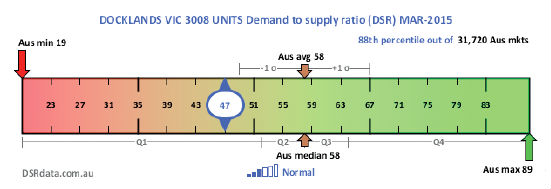
The context ruler in Chart 3 shows that a DSR of 58 is the current average. Investors should look at markets with scores above this.
Conclusion
Data plays an ever more important role in property research. As the variety of statistics increases, analysis of what is truly important to drive growth needs to be all the more focused.\