Statistics were a bit hit and miss in the past, but nowadays data is like gold. Sophisticated indicators are already outperforming the divining rods of the property experts.
In this article I’ll show you the basic data you should be acquiring at each step in your research, and how to make sense of it all. You won’t need a Google-like data centre in your garage. You can leverage from the efforts of industry pioneers using the latest technology right now.
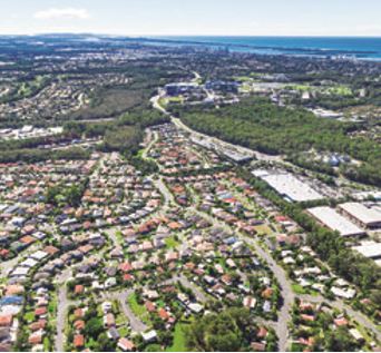
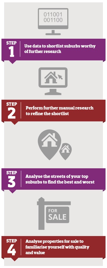 PROCESS OVERVIEW
Step 1: Shortlisting
Shortlisting is the biggest and most important step. This is where most of the action happens to set you up for success. It’s where the most data is considered and takes the longest to explain. Yet strangely, it’s the fastest research you’ll do because of the big data search engines now available.
There’s a lot to researching your next investment property beyond gazing over indicators. You can’t make a decision based purely on these numbers, well not just yet anyway. But where the indicators come in handy is in weeding out 99% of the ordinary suburbs not worth looking at, and quickly too. This leaves a manageable number of ‘maybes’ that you can analyse in greater detail, taking your time.
Here’s how it works
A vacancy rate of 3% is not an alarm ringer, right? But when you’re after the best markets, you should probably only look at those with a vacancy rate of 2% or lower.
Thirty-eight per cent of property markets in Australia had a vacancy rate of 2% or lower at the end of March 2016 (source: DSRdata.com.au). So, by applying that criterion for vacancies alone, you’ve already managed to weed out more than a third of the Australian property market.
Applying the same strict criteria to other indicators for the remaining locations will weed out even more poor investments. Imagine applying that to a whole range of indicators. What you’re left with is pure investment grade property markets – the best of the best. That’s what shortlisting is all about. The first criteria you need to apply are your own unique circumstances.
Criteria specific to you
Your specific investment strategy and financial circumstances will weed out a huge chunk of unsuitable property markets. This is where you start your filtering. The following sections explain how to filter for the most common criteria investors have.
Budget
If you can only afford a $400,000 property, then you need to eliminate all markets where prices are typically higher than this. Note that if your budget is $800k, you don’t want to weed out $400k property locations. Why not diversify in two different locations?
 Location
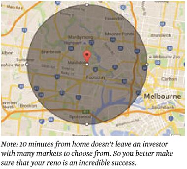
Some investors will plan a DIY renovation for their next purchase. So they need a location close to home. Map-based searches within a 10km radius of home might be of help here to shortlist possible suburbs. That will weed out a vast number of no-chance suburbs.
Cash flow
Some investors are wandering towards the edge of serviceability. If this applies to you, a higher cash flow property might be just enough to stop your mortgage broker from fidgeting nervously at your next meeting.
Looking at higher-yielding locations will help reduce your shortlist tremendously. But be careful – high-yielding locations can 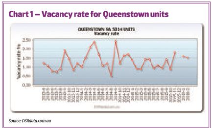 sometimes be poor-growth locations.
Be cautious when it is cheaper to own than to rent. Currently, that’s a yield of around 6.5% or higher. Very low vacancy rates place pressure on rents to rise. So if you’re after high cash flow, you might want to factor in an abnormally low vacancy rate too. Anything less than 2% should do.
Note: As stats like vacancy rates might be volatile in thinly rented markets, check the recent history of vacancy rates for the last few months. Don’t take the most recent reported figure as gospel. Chart 1 shows a good example of how volatile the figures can get.
How to quickly calculate cash flow
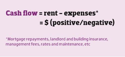
For example:
Rent $430 – expenses $480 = -$50 per week (negative)
Rent $340 – expenses $300 = +$40 per week (positive)
Rent $300 – expenses $300 = $0 per week (neutral)
Calculating the cash flow of a potential property is one of the most important aspects of your research. While calculating the basic or gross cash flow by comparing the potential rent with the purchase price is fairly easy, a number of factors can affect your actual cash flow position. Often-overlooked issues include:
• Maintenance and repairs
The more expensive the property, the higher the maintenance bills. It’s usually a good idea to assume that between 1% and 1.5% of your property’s total value will be diverted into maintenance and repairs every year.
• Depreciation
A quick Google search will reveal a number of internet sites that provide a free depreciation calculator. This will affect how much you can claim in tax incentives.
• Rates and owners corporation fees
Rates will often amount to between $1,300 and $1,700 a year, while body corporate or owners corporation fees are often $700 to $1,100 annually.
Criteria relating to all investors
Growth
No matter what your property investment strategy, capital growth plays an important role. Even if you plan to renovate and sell in only a few months, your bottom line will be much better in a ‘kicking’ growth market. So how do you find it?
You’ve heard it a hundred times: prices grow when demand exceeds supply. All your research should target analysis of supply and demand; keep that at the forefront of your mind.
The trick is to accurately identify markets in which demand exceeds supply. A gut feeling simply won’t cut it. We need numbers to keep us objective. Fortunately, we can get a lot of numbers for almost any property market in the country within a few minutes.
Following are some of the indicators you can use, and how to interpret them. Suburb stats based on these indicators can be found in the data section at the back of this magazine.
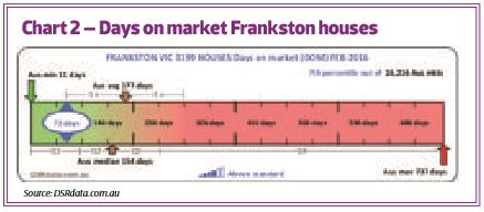 Days on market (DOM)
The number of days a property spends on the market is a great indicator of demand relative to supply. If properties are in high demand yet low supply, they get snapped up very quickly.
Some of the fastest-moving markets have an average DOM of less than a month. Chart 2 shows that the lowest DOM for any market in February 2016 was 11 days.
Frankston houses were at 73 days, which seems high. But the chart shows the average DOM countrywide was 177 days and the median was 154.
As you can see from Chart 2, a DOM less than about 75 days represented a healthy market in February. The vast majority of suburbs around the country had a DOM higher than this. This doesn’t mean Frankston houses are a ‘buy’ – it’s only one indicator after all.
Vendor discount
The average vendor discount is the difference between the original asking price and the eventual selling price in percentage terms, averaged for an entire property market – usually a suburb.
In hot markets, sellers (ie vendors) don’t need to drop their asking price by much to get a sale. So the discount is an excellent indicator of the demand relative to supply. The lower this figure, the higher demand is relative to supply.
A typical discount for an Australian property market in early 2016 was 7%. Some markets actually had a negative discount. That means offers exceeded the asking price on average for the suburb. Now that’s hot.
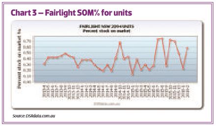 Stock on market (SOM)
Stock on market, or SOM, is an indicator of supply. With supply being the enemy of growth, we want the SOM to be as low as possible. Since some markets are small while others are big, a better figure to look at is the percentage of stock on market, or SOM%.
The average SOM% was 0.81% across Australia for March 2016. So anything above 1% is getting on the high side.
Chart 3 shows how thinly traded markets have a volatile SOM%. It’s crucial therefore to check a historical chart.
Regardless of what the true SOM% was, Chart 3 shows that Fairlight units have had a better-than-average SOM% for the last three years. It’s probably around 0.5%.
Sales growth
A change in sales volume can sometimes be an indicator of future capital growth. When markets heat up, stock that was sluggish starts to move quickly. However, sales growth can also be an indicator of increasing supply. If 500 new homes suddenly come on to the market due to heavy developer activity, sales growth will be high even if there is oversupply.
Like most individual indicators, at best this one is an asterisk to mark a suburb with potential and to justify further research.
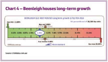 Average annual growth or long-term growth (LTG)
The long-term growth, or LTG, is the growth rate averaged out over the last 10 years. If you think your market may have already had its run of good luck, this indicator will be high – maybe even ‘double digit’ high. Instead, you want it to be closer to zero.
Chart 4 shows the LTG for Beenleigh houses was 1.70% at the end of February 2016. More importantly, we can see from Chart 4 that the average LTG Australia-wide was about 4%.
A suburb with growth less than 4% is one that has not had a recent surge in prices. That doesn’t mean it’s about to. All it means is that you haven’t missed the boat if it is about to. Other indicators are needed to gauge when that boat is about to set sail.
Quarterly growth
Quarterly growth is the amount of growth in the last three months. If you’re waiting for a flat market to take off, this is the statistic to keep an eye on.
It takes time for an infrastructure project to take off. You don’t want to jump in too early. Month-to-month medians can be deceptive, so a three-month statistic is a better indicator.
Demand to supply ratio (DSR)
The demand-to-supply ratio, or DSR, is a score out of 100 for the ratio of demand relative to supply for a property market. It combines a number of statistics into a single indicator.
More
There are a ton more indicators but only so much time to discuss them. The ones presented here should be enough to get you started. Once you’re familiar with these and eager for more, try these head spinners:
-Auction clearance rate (ACR)
-Online search interest (OSI)
-Ripple effect potential (REP)
-Neighbour price balancing (NPB)
-Market cycle timing (MCT)
-Unit to house value comparison (U2H)
-Percentage of Sales by auction (SBA%)
Step 2: Refine your shortlist
The idea of this step is to refine potential hotspots in your shortlist from Step 1. Some might not stack up on your second look. You might also want to promote others to higher in the list after uncovering more information. The following sections explain what research to do.
Check the statistics
From time to time statistics suffer from anomalies. Don’t trust any of them. Check out the most important ones to you. For example, if cash flow is important, confirm the vacancy rate by going to one of the rental listing websites. See if the number of properties currently available for rent is what you’d expect for the vacancy rate quoted.
You should also check the yield. Look for similar properties for sale that closely match the location and features of the properties for rent. While you’re looking at properties for sale, see if the number roughly matches the published stock on market as well.
The first thing that can have a negative effect on your top shortlisted suburbs is oversupply. There may be a new development about to flood the market. You need to check this isn’t about to happen. Go to the local council website for the suburbs of interest in your shortlist. Find the page that lists development applications. Try to discern between applications lodged and applications approved. Gauge the size of each development by the number and types of dwellings.
The point is to know how many properties are about to come on to the market. You want to measure supply in the not-too-distant future.
Note: Some local government areas (LGAs) are large and might have what looks like a large number of applications, so find out the LGA’s population and contrast it against the amount of building activity. Do this a dozen times and you’ll get a decent idea of what ‘too much’ building activity is. Remember that supply is the enemy of price rises. Generally, you don’t want heavy developer activity. Ideally, you don’t want any.
Public spending
Check if any public spending will add to or detract from the suburb’s appeal to residents. Public spending comes from the local council, state or federal governments – usually infrastructure projects.
Big-impact projects are usually funded by big pockets like those of the federal government. Extending a train line requires a massive budget and will have a huge impact on property prices.
Low-impact projects are usually the responsibility of local councils and might only involve the beautification of nature strips or the extension of a business precinct.
Private spending
Private spending, such as investment by big companies, can impact on employment opportunities. Check where banks, supermarkets, restaurant chains and hardware stores are opening new outlets. New private hospitals and schools also drive demand.
Keep in mind that recent changes are more influential than existing qualities. You might find a suburb with excellent public transport, great schools and ideal shopping, but if those qualities have been part of the suburb for a decade and remain unchanged, those qualities will likely be already priced into the market.
Contact local realtors
Contact a few of the local real estate agents and ask them their opinion about the current nature of the market and what they see happening in the not-too-distant future. Be sure to ask them for their reasons. While you have them on the phone, you might also like to do Step 3 of your research...
Step 3: Street-level research
This step is all about understanding the suburb at the street level.
Ask agents
Start by asking local real estate agents if there are any ‘no-go’ zones or trouble spots. Check if there are any blocks that are pure housing commission or have a high density of housing commission homes. Ripehouse.com.au and Microburbs.com.au can help here.
Ask the agents where their preferred locations are, perhaps where they would buy right now if they had the cash.
Ponder over a map
Look at everything you can on a map. Look at vacant land, parks, trees, the streetscape and proximity to amenities. Switch between satellite and map views. Check the street view, where possible. Nothing beats a drive around, but pondering over a map for half an hour will highlight more precisely what you want to see.
The key to the use of maps is finding locations that are within walking distance of the most important amenities, but far enough from undesirable areas.
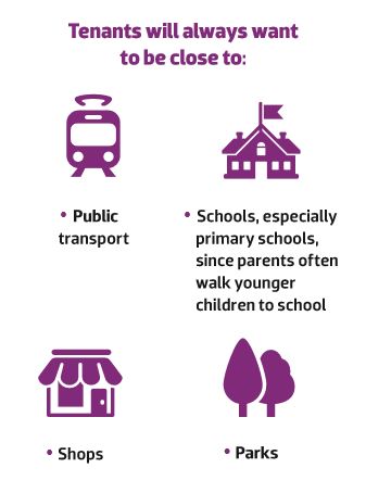 Note: Being too close to some of these amenities can actually be a deterrent for many potential tenants. A balance needs to be struck, considering their need for peace and privacy.
Some undesirables might include:
-Heavy intersections, main roads or thoroughfares
-Industrial areas
-Skate parks
-Poorly lit streetscape
-Small laneways
-Vacant blocks of land that could be developed on
-Service stations
Pay a visit
When you eventually get around to visiting the suburb, note the things online research can’t uncover:
-Pedestrian/shopper volume and location
-Traffic volume and flow
-Terrain/views
-Smells (sewage/sea/industry)
Step 4: Property-level research
Most high-DSR locations will not have many properties to choose from because of limited supply. But you’ll probably have some choice. How do you know what to pick? Step 4 helps you weed out the poorer options.
Ideal property type
Ask the local real estate agents what kind of property is most sought after by buyers and renters. Is it a house, apartment, townhouse or something else? How many bedrooms? What standard of finish?
If they just so happen to have a perfect property for sale right now, ask a different agent for their opinion.
In neighbourhoods with many character homes, you may find an opportunity with a property that stands out from the crowd. Again, ask the local real estate agents if these are in higher demand.
 Surrounding properties
Although online photos of the dwelling may give an adequate idea of the property, neighbouring houses are never included. You should examine these to ensure you’re not buying the best house on the worst street.
Orientation
Remember that in Tasmania and other cooler climates, good exposure to the sun in the morning is important, whereas in Darwin, for example, protection from the sun is crucial.
Price to offer
Use past sales reports to get a good idea of fair value. Don’t expect to pick up a bargain in these high-DSR markets. As vendors continue to knock you back, you’ll eventually get an idea of what they are willing to accept. Be prepared to pay top dollar to get into top markets.
Conclusion
The next few years will trap a lot of dinosaur investors in the mud. Keep supply and demand at the forefront of your research and you’ll be on the right track.
Don’t rely on a single statistic when data mining. More data means less risk and better investment decisions.
And don’t swallow the latest month’s figure. Get a chart to check the history.
Embrace the new technology and use it to get the edge over less-informed investors, real estate agents, owners and developers.