Do suburbs at the upper end of the price spectrum, fare better during tough times than the cheap markets?
No. In fact, it is exactly the other way around:
“Cheaper markets hold their value better when there’s a correction. It’s expensive markets that fall the most.”
Tough Times
There aren’t many cases in Australia’s last 30 years where national prices went backwards. So, I’m counting “close calls” like this one…
It’s a bit of a stretch to claim there’s a correction from mid-1995 to early 1996.
There’s a clearer case after the GFC in 2008.
Peak to trough lasted 6 months and the total percentage fall was -1.5%. And it took 6 months from the bottom to climb back to where it was.
The next case was 2011.
This correction started in February 2011 and bottomed out in Feb 2012. The degree of correction was a bit more than 2%, so again nothing alarming.
Now we have three country-wide corrections to examine. And at the time of writing [2019] we’re in the middle of another correction. It’s mostly being felt in Sydney and Melbourne. So, we’ll have a look at those cities in isolation later.
Best & worst growth
Suburbs closer to the CBD are more expensive. Let’s see where the biggest falls in prices were.
For the 1996 price correction I found that the worst 100 falling markets had a median distance from the CBD of 35 km. And the best 100 rising markets had a median distance from the CBD of 87 km.
- Worst 100 falling mkts > 35 km to CBD
- Best 100 rising mkts > 87 km to CBD
What about the 2008 price correction?
- Worst 100 falling mkts > 17 km to CBD
- Best 100 rising mkts > 47 km to CBD
And for the 2011 price correction:
- Worst 100 falling mkts > 24 km to CBD
- Best 100 rising mkts > 33 km to CBD
As you can see, in all 3 correction periods, the top 100 performing property markets were further away from the CBD than the bottom 100 performing mkts.
Closest & furthest
Let’s look at how the closest and furthest 100 markets from the CBD performed.
For the 1996 correction, the median growth of the 100 closest markets to the CBD was -3.13%. The median growth of the 100 furthest markets from the CBD was -4.38%.
- 100 closest mkts > -3.13%
- 100 furthest mkts > -4.38%
What about for the 2008 correction:
- Closest 100 mkts > -5.86%
- Furthest 100 mkts > -2.62%
What about the 2011 correction?
- Closest 100 mkts > -5.39%
- Furthest 100 mkts > -3.7%
We’ve applied 6 tests now and in 5 of those 6, the markets further from the CBD have held their values better than those closer.
Most expensive vs. cheapest
Let’s pick the 100 most expensive markets and the 100 cheapest markets and see which group of suburbs had the biggest fall in prices during a correction. And let’s see if breaking things down by property type helps this time.
For the 1996 correction:
- Most expensive 100 city house mkts > -2.75%
- Least expensive 100 city house mkts > -2.30%
There’s not much in it, but cheaper fared better than expensive for houses. What about for units…
- Most expensive 100 city unit mkts > -3.23%
- Least expensive 100 city unit mkts > -2.44%
It’s the same story for units, but the gap is a bit bigger. Also, note that in both cases, units dropped more than houses.
Let’s check the 2008 correction:
- Most expensive 100 city house mkts > -6.88%
- Least expensive 100 city house mkts > 0.13%
It’s a lot clearer in this case. In fact, houses in the least expensive markets actually had positive growth in the middle of a country-wide decline!
For units:
- Most expensive 100 city unit mkts > -6.84%
- Least expensive 100 city unit mkts > -1.37%
2011 correction:
- Most expensive 100 city house mkts > -6.06%
- Least expensive 100 city house mkts > -2.09%
Again, it was the expensive markets that suffered the most. And for units it was about the same.
- Most expensive 100 city unit mkts >-5.85%
- Least expensive 100 city unit mkts >-1.87%
What we have so far is a fair amount of evidence to refute the claim that cheap capital city property mkts further from the CBD fall more than expensive capital city markets during national price corrections.
Deciles
You might think I’m fudging the data, so let’s hear from Core Logic.
 Source: CoreLogic
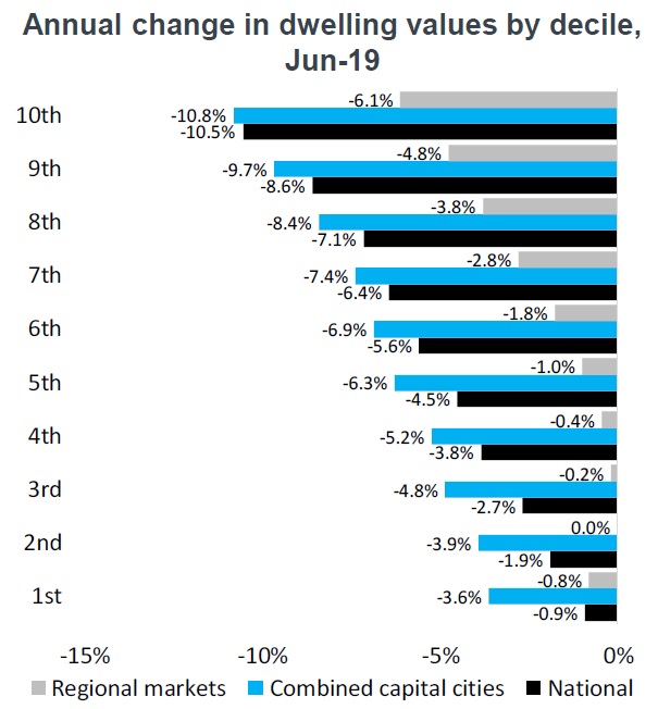
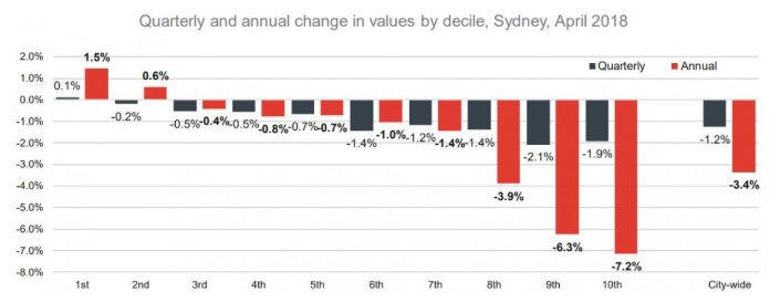
The 1st decile is on the left and it represents the cheapest 10% of the market. The 10th decile is the most expensive to the far right.
This chart shows the growth for each decile in Sydney from April 2017 to April 2018. Remember that 2018 was when Sydney started to correct after a great bull run from 2012 to 2017.
The black bars show the growth over the 3 months up to April 2018. The red bars show the 12 months growth up to April 2018.
This chart clearly shows that when Sydney started correcting, not only were the corrections biggest in the more expensive suburbs, but in the cheaper suburbs, there wasn’t a correction, growth was still happening.
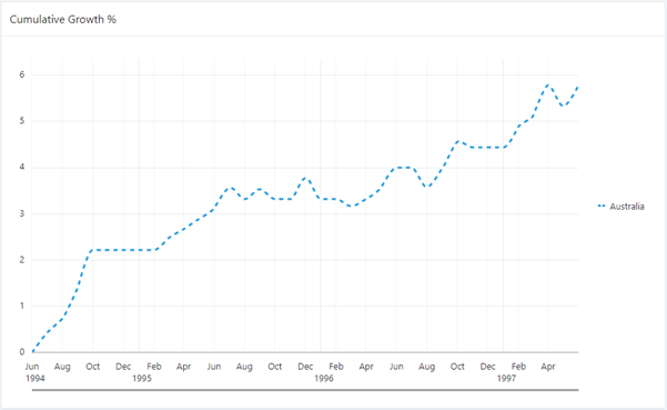
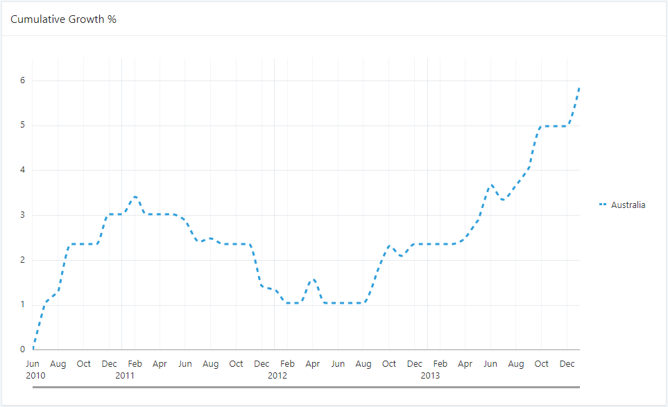
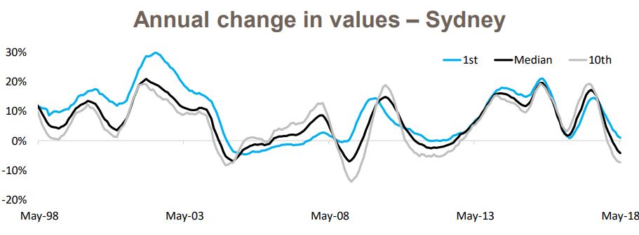
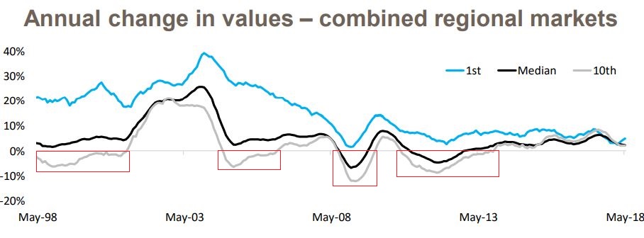
Decile history
The following chart is also published by Core Logic and shows how Sydney’s upper and lower deciles have performed historically and compares them to the median.
 Source: CoreLogic
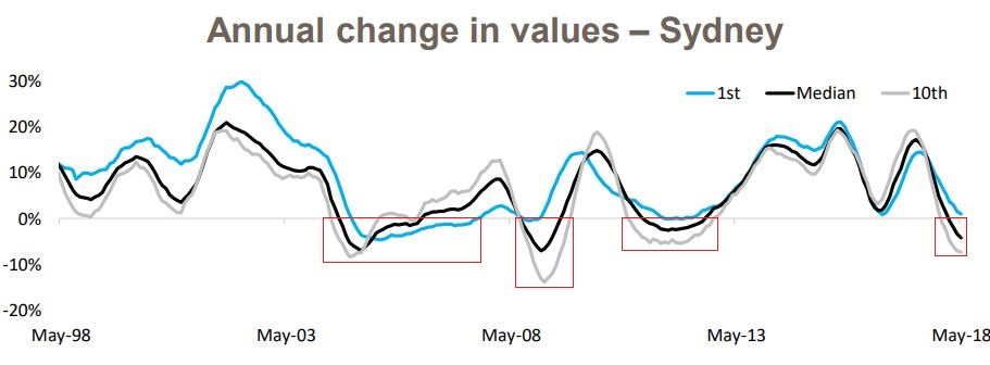
Taking a closer look at Sydney’s history, you’ll see this is actually a common occurrence. In bad times, the lower decile holds its value better than the upper. I’ll highlight the corrections with red rectangles.
 Source: CoreLogic
As you can see, in 3 of these 4 cases where growth was negative for Sydney, the expensive markets (the grey line) correct more violently than the cheap markets (the blue line). In fact, in 3 out of the 4 cases where Sydney had negative growth, the cheap markets managed to avoid it almost entirely.
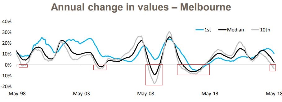
This is not just a Sydney thing. Here is the same kind of chart for Melbourne.
 Source: CoreLogic
Over the last 20 years, the expensive end of the market has corrected 5 times while the cheaper end corrected only once.
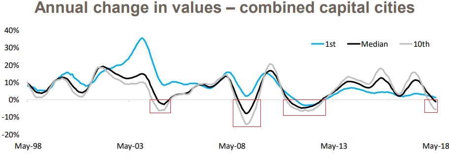
It’s a similar story for all the other state capitals. The following chart shows the combined capitals.
Source: CoreLogic
Interestingly, if you look at regions instead of capitals, the cheaper markets really shine…
 Source: CoreLogic
There wasn’t a single case in the 20-year period shown when the cheaper segment of a regional market had negative growth. But there were 4 periods where the expensive part of the market went backwards.
More recently
Here’s a more up to date decile report from Core Logic.
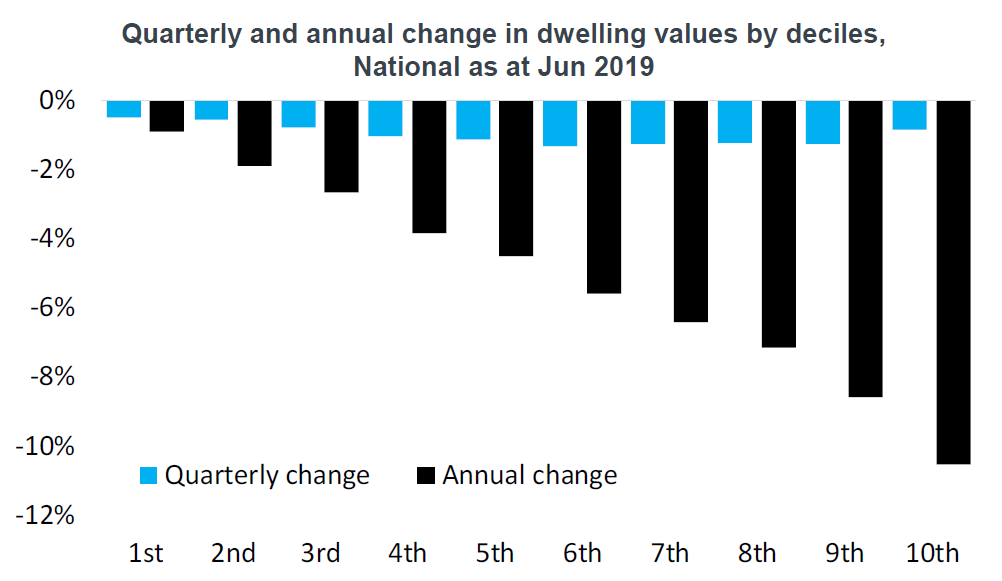
The first decile is the one on the left. It has had less negative growth than the more expensive deciles to the right.
The same trend holds true in regional markets as in city markets as seen in the next chart.
Definitely during the year to June 2019, there is absolutely no doubt that cheaper markets fell the least.
Logic
So, why is it that the lower end does perform better in tough times? Some theories:
- Part-time work
- Over-reaction
Part-time work
I reckon it’s a lot easier for lower income earners to do something to make ends meet. If they get a part-time job stacking shelves at Woollies or helping out at Bunnings on the weekend or even running the odd Uber trip, it supplements their income. It might not be in a significant way, but it’s more significant than a sales exec on twice the salary.
There’s also a possibility that more jobs in “essential services” are lower income jobs. These may have more persistence during tough times.
Over-reaction
There might be greater over-reaction in the expensive side of town, not just when times are tough, but when times are good too. It’s usually the business owners who are on cloud nine in a booming economy that pay recklessly to acquire their slice of the top-end.
They start thinking much more practically in tough times and can’t justify spending a couple of mil on a house when they can spend half as much and still get by.
Conclusion
Regardless of the reasons why, the data is clear: cheaper, less desirable markets, further from the CBD suffer less in a correction than exclusive, affluent markets closer to the CBD.
....................................................................................
 Jeremy Sheppard is head of research at DSRdata.com.au.
DSR data can be found on the YIP Top suburbs page.
Click Here to read more Expert Advice articles by Jeremy Sheppard
Disclaimer: while due care is taken, the viewpoints expressed by contributors do not necessarily reflect the opinions of Your Investment Property.