Introduction
Many claim that properties with a high long-term growth rate are “proven performers”. The ironic thing is that the real proof says the complete opposite.
“Above average historical growth is actually an indicator of below average future growth”
Many professionals in their research will “back-test” a property...
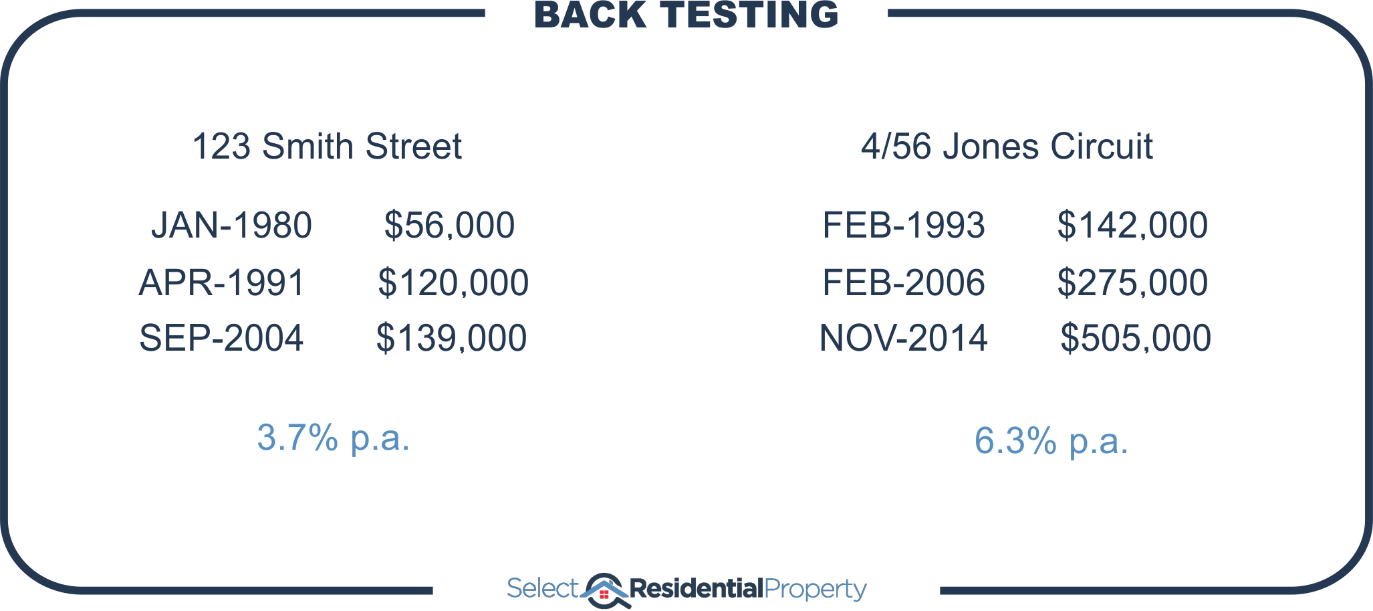
The theory is that there’s something inherently special about this property which explains why it’s had such high historical growth and why that high growth will continue.
Nothing lasts forever
Just because it happened in the past, doesn’t mean it will continue to happen in the future.
“Every time a trend extends, you’re one step closer to that trend’s end”
A close look at historical data highlights that trends don’t go on forever. It’s illogical anyway. For the theory to hold true, if a property had negative growth in the past, then it must have more negative growth into the future.
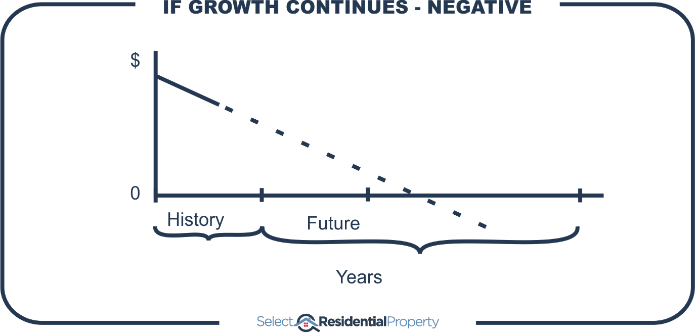
The longer that future goes on, the lower the property’s value, until eventually it’s worthless. Another year and it will actually have negative value – the seller would pay the buyer.
Perhaps this sounds silly because the timeframe I’m choosing is too short.
Historical growth vs Future growth
Here is a chart showing the relationship between past growth over a roughly 15-year period and future growth that followed in the next 15 years.
This is called a scatter plot. Every purple plus sign represents a suburb. The axis at the bottom, shows the past growth as a per annum growth rate for the 15 years from 1990 to 2005.
Suburbs that had exceptional past growth from 1990 to 2005 will appear on the right side of the chart. You’d be targeting those suburbs if you believed in this theory.
The left axis shows the growth of the same suburb for the next 15 years, from 2005 to 2019. Suburbs that had excellent growth from 2005 to 2019 would appear towards the top of the chart.
Assuming we were an investor in the year 2000 looking at past data to see where to invest for future growth, we’d pick suburbs to the right of the chart.
But you’ll notice that the suburbs that had excellent past growth on the right aren’t towards the top of the chart. This is because they didn’t have good future growth.
Trend line
The orange dotted line that slopes down from left to right is the trend line that approximates the general relationship between past growth and future growth.
If future growth reflected past growth, the trend line would be climbing up from left to right. But instead, it’s going the other way.
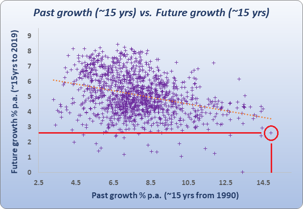
The suburb with the best past growth (15%) was at the bottom of the class for future growth (2.6%).
If you picked the lowest past growth market, which is on the far left, you would have been better off.
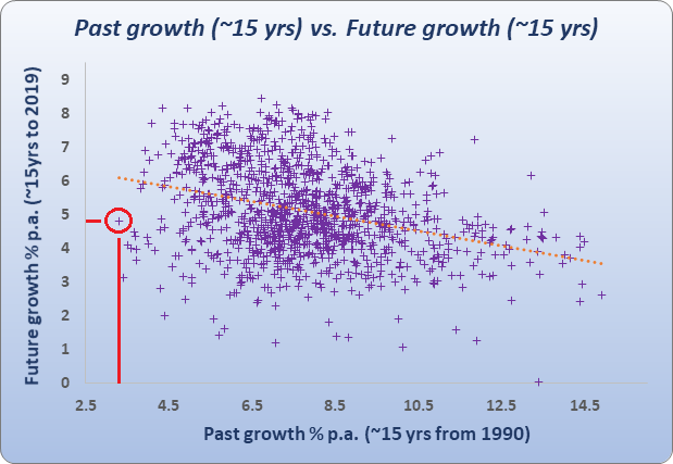
The lowest growth of the 1st 15 years up to 2005 was a suburb with only about 3% growth per annum. But over the next 15 years it had nearly 5% growth per annum – nearly double that of the best performing market for the 1st 15 years.
What past data says
The charts suggest that low past performance is a better indicator of high future performance – not the other way around as many experts have taught. There’s no logical basis to their theory. On the contrary, there is convincing evidence to support the opposite.
The following chart shows the relationship between the past 10 years of growth and the 10 years that followed. The results were averaged over thousands of Australian property markets covering the last 30 years.
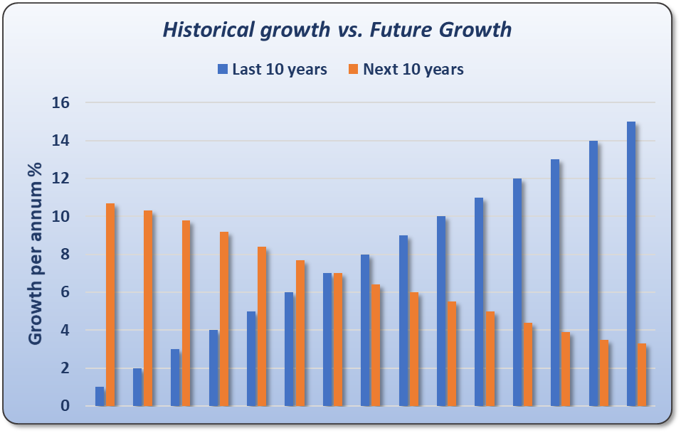
Every property market was measured to see how much it grew over a 10-year period. Then that market was followed over the next 10 years. There’s a clear inverse relationship between past growth and future growth over a 10-year period.
“For every year of above average growth in the past, there’s more likelihood of below average growth into the future and vice-versa”
No property can continue to outperform the average growth rate truly long-term. What happens is the property eventually becomes so unaffordable compared to other properties nearby that it experiences a prolonged period of underperformance to bring it back in line.
Timing entry
Investors are far more likely to buy at the peak if they look for high growth history. And they’re far more likely to ignore good opportunities at the bottom of the cycle. Here’s an example:
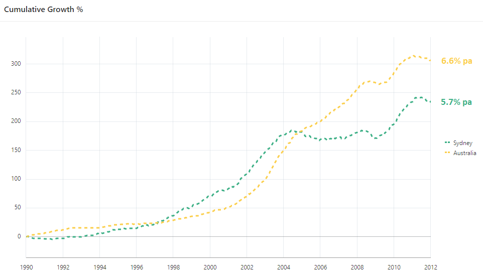
In late 2012 a boom started in Sydney property prices after a long drought. Prices had been relatively flat for around 9 years by 2012.
But by the end of 2017, just 5 years later, Sydney property prices had risen by around 60%.
- Sydney
- 200+ years à 40% of value
- 5 years à 60% of value
The last 200 years of historical growth prior to 2012 accounted for only 40% of Sydney’s value. More than half of the city’s value came in the last 2.5% of its history. That’s like…
“Creating more than half the wealth you’re going to live on in retirement, in the last year of your working life”
Almost every Sydney property had a poor history of long-term growth by 2012 because of the flat market of the past. The average growth rate for the 10 years prior was around 2.5% per annum.
Using a back-testing proven performer approach, Sydney had 5.7% per annum growth since 1990. But the average across all of Australia was 6.6% per annum. As a result, most properties in Sydney should have been discredited using this back-testing proven performer approach. But 2012 was actually the perfect time to enter the Sydney market.
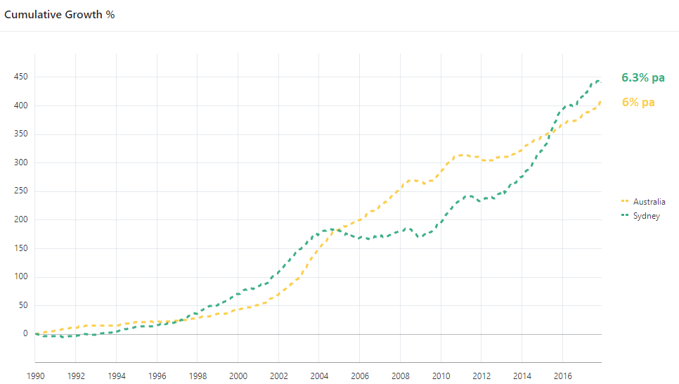
Conversely, by the end of 2017 almost every Sydney property had excellent long-term growth because of the boom that had just passed in the last 5 years. From here if you were using the proven-performer back-test approach, you would have bought in Sydney and discredited other markets around Australia like Hobart.
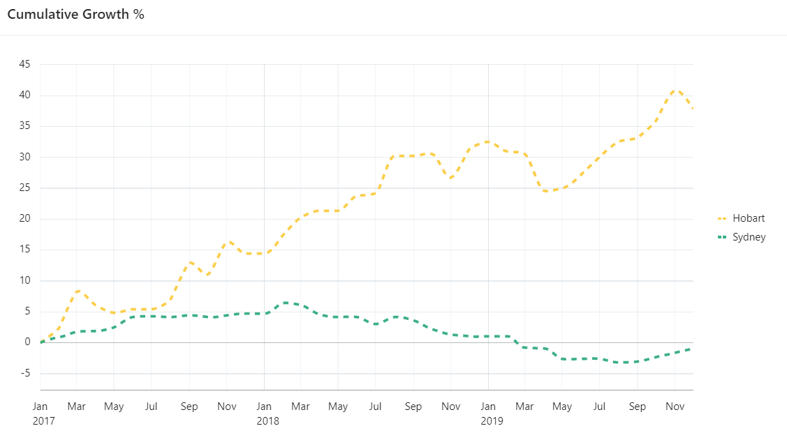
But fast-forward to the end of 2018 and look how the lead changed.
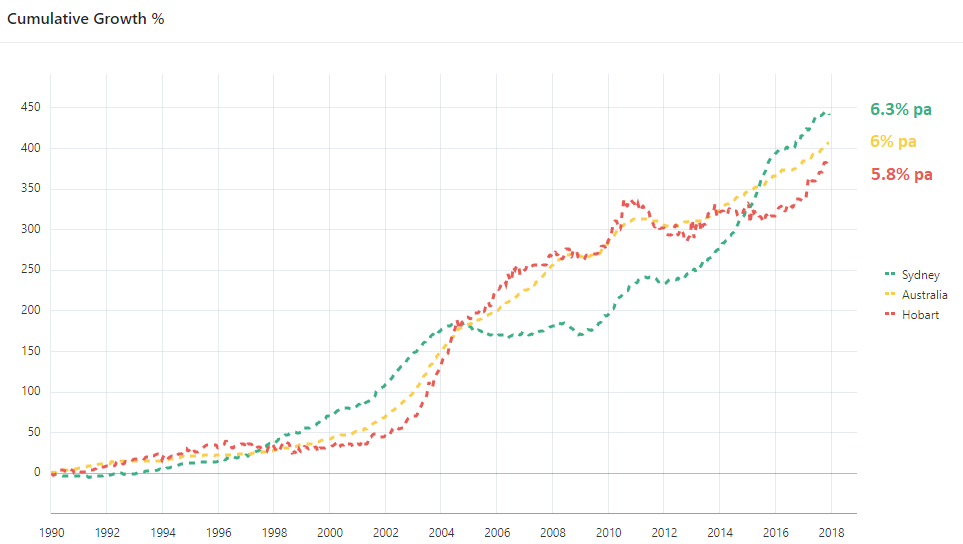
Hobart actually had better long-term growth than Sydney by the end of 2018.
“How can we choose the best long-term performer when it keeps changing?”
From 2017, the difference in growth between Hobart and Sydney was around 40%, a complete reversal of the 3 years prior.
There’s no such thing as a “proven performer”. The proof is the opposite – a costly opposite.
....................................................................................
 Jeremy Sheppard is head of research at DSRdata.com.au.
DSR data can be found on the YIP Top suburbs page.
Click Here to read more Expert Advice articles by Jeremy Sheppard
Disclaimer: while due care is taken, the viewpoints expressed by contributors do not necessarily reflect the opinions of Your Investment Property.