The reality is that risks lurk in every corner of the investment process, including:
-your job security
-your experience and attitude
-interest rates offered by lenders
-bad tenants
-paying too much
-suburb choice
In this article, I’ll focus on suburb selection. Some valid fears investors face in choosing a property market might include:
-extended vacancy periods
-falling prices
Some property markets could prove lucrative if risks were adequately addressed. Other markets should simply be avoided without a second thought.
Some risky markets hide behind clever marketing. Some are obscured by too much media attention or misreporting. So, how do we blow away the dust to see what lurks beneath? There are two categories I want to address in turn:
1. What we do know or can easily find out, eg we can
look up vacancy rates
2. What we don’t know, eg what if there is limited data
for our suburb of interest?
Putting risk into perspective
 Either combination of those first two factors will cause the investor concerns about, for example, high vacancy rates, falling prices, etc. The third is a lottery in terms of what you’ll end up with.
Most investors want to focus on the upside and only look down at risk if it is staring them in the face. But by analysing supply and demand you not only address risk but also address return at the same time.
Let’s have a look at some classic examples of risky markets.
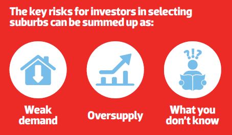
Weak demand
A market with weak demand is one that buyers (and renters) are not interested in. This may have been the result of a drop in employment, or a natural disaster, or the opening of a sewerage treatment works. Whatever the cause, weak demand will show up in various indicators, such as:
-low ACR (auction clearance rate)
-low percentage of properties listed for sale by auction (PSA)
-low percentage of properties listed for sale with open inspections
-high number of days a property spends listed for sale before eventually selling (days on market, or DOM)
-high discount – the amount by which a seller must lower their asking price to get a sale
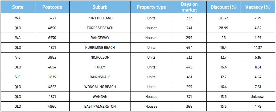
Given the drop in the resources sector, mining towns are a good example of markets now experiencing low demand. Table 1 contains a list of demand indicators for some of the weaker markets around the country as at the end of November 2015.
There’s no surprise that the mining town of Port Hedland in WA features first on the list. With the decline of the resources sector you might have expected this.
Workers were drawn to Port Hedland at the height of the resources boom. Some investors capitalised on this demand and prices rose. But with nothing much else going for the industry in that location, there was no option but for prices to fall post-resources boom.
Note that some properties in these markets may spend over a year listed for sale. Also note that the discount from the original asking price to the eventual sale price is very high. Vendors need to come down a long way just to get a sale. And the vacancy rates are also alarmingly high.
Table 1 – Examples of weak demand
Table 2 – Examples of oversupplied markets
Source: DSRdata.com.au
Oversupply
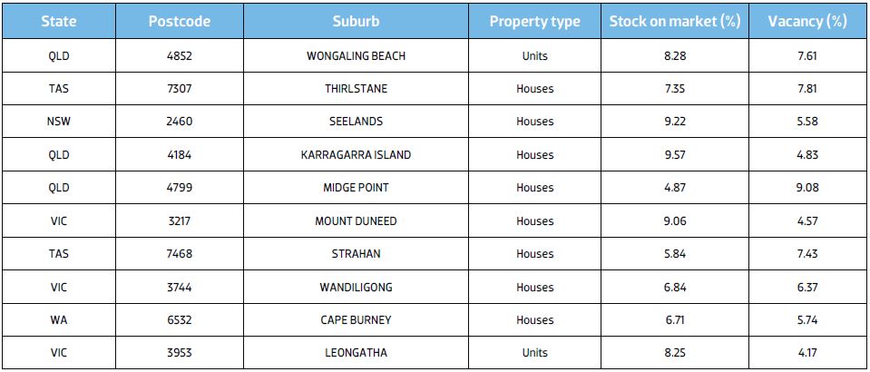
Now let’s look at some markets with classic oversupply problems. These can be identified by a high percentage of stock on market. Table 2 (above) lists some of the worst markets for oversupply around the country as at the end of November 2015.
Oversupply can be caused by a departure of residents from the location, leaving vacant dwellings, or by overconstruction by unfettered, zealous developers.
You might think the percentage of stock on market (SOM%) seems reasonable, but Chart 1 places it in the context of normal markets around the country.
Chart 1 – Context ruler for SOM% Midge Point houses
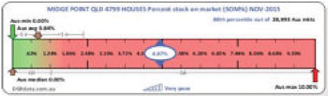
You’ll notice that the vast majority of markets have an SOM% of under 1%. Above 2% would be considered an edge case. But Midge Point has an undoubted oversupply of 4.87%.
Can we rely on the stats?
Of course not. Doing so would expose you to more risk. In every case you should try to verify the stats. Some indicators suffer from volatility. So looking at a historical chart might simply uncover a bad month in an otherwise ordinary indicator.
Chart 2 – Port Hedland units’ DSR
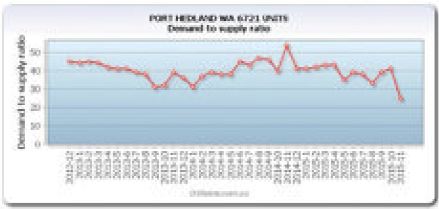
Chart 2 shows the change in the Demand to Supply Ratio+ (DSR+) for Port Hedland units over the last three years.
As you can see, the DSR for the end of November 2015 was a particularly bad one, but it might bounce back up to 40 again in December. Even at 40 it is still comfortably below 50 and therefore not a great market for investors to buy in.
We can use the statistics for a quick gauge of risk. But then verifying the figures before drawing a conclusion is essential. The more statistics that are pointing in the same direction, the more confident we can be.
You can jump online and see for yourself how many properties are listed for sale. Google the area and see how many houses there are in a suburb. If there are pages and pages listed for sale in a relatively small area, then you’ve confirmed an oversupply. You can also check the number of properties listed for rent to confirm the vacancy rate.
What you don’t know
There is another aspect of risk we can address using the statistics – what we don’t know. We may have data about vacancies and auctions, but we may not have anything else. That is simply not enough.
At DSRdata.com.au there is a Statistical Reliability figure calculated for the DSR and DSR+. The less information available or the poorer the quality of the base data, then the less reliable the stats are. So we could also find risky markets by simply finding those with the lowest statistical reliability. Table 3 shows a list of the markets we know the least about, statistically speaking.
The Statistical Reliability figure is scored out of 100. The lower the figure is, the less reliable the other statistics are. As you can see, both the DSR+ and the SSI-low risk columns show poor figures for these markets.
Safe markets to invest in
You’re probably not interested in high-risk markets, right? You want to know about low-risk markets. So we could turn the procedure upside down and find some of the safest markets to invest in.
That would be an OK way of identifying safe markets. But there are a couple of gotchas.
Some markets can become high-demand markets largely based on sentiment rather than value for money. In other words, buyers start a frenzy based on a fear of missing out. Emotions are relatively fickle and can vanish within a few months in some markets. The emotional buyer is more likely to rush in and pay too much. This pushes down the DOM figure and the vendor discounting too.
But emotional buyers have little impact on vacancy rates and yield. A signed lease can’t be dissolved overnight like sentiment about a market. You can see, therefore, that some of the stats are more important than others when searching for the safest markets to invest in.
This complexity is all handled inside the SSI low-risk indicator. It favours the value-based statistics like yield and vacancy rate less than the sentiment-based data like days on market and discounting.
So our criteria for the safest markets are quite simply:
-great score for the SSI low-risk indicator
-great score for the statistical reliability indicator
Table 4 contains some of the safest markets to invest in as at the end of November 2015.
Table 3 – Low statistical reliability markets
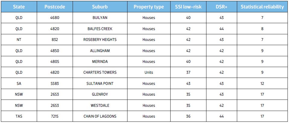
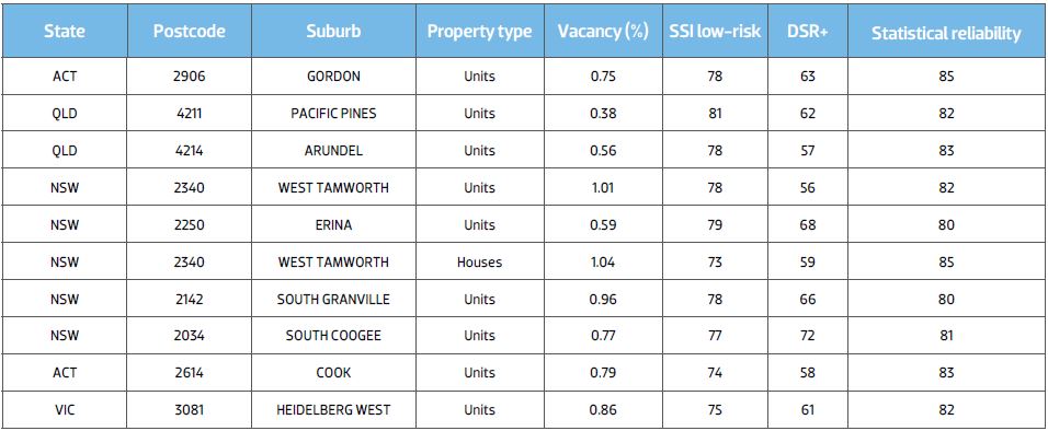
Table 5 – Side-by-side comparison
Safe vs risky
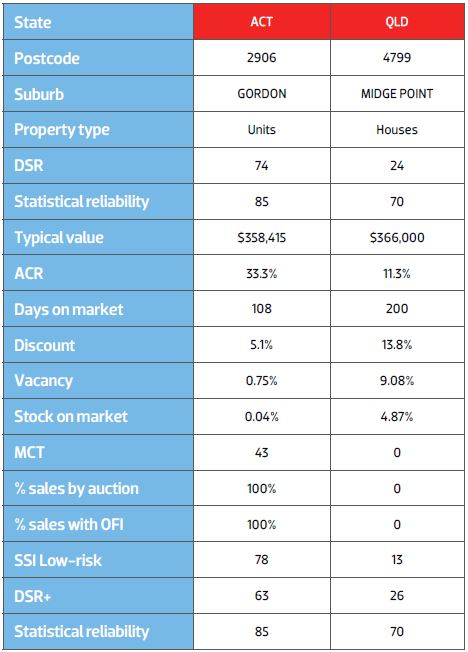
Let’s compare Gordon units in the ACT with houses at Midge Point in Queensland. This will help crystallise the type of data typical for a risky market and a safe market so we can spot trouble straight away in future.
Some of the statistics don’t differ by much, for example the auction clearance rates. With small sales volumes, the ACR can bounce around a bit from month to month. You should always check a historical chart to see if that’s the case.
Some of the differences, however, are really quite dramatic, like the percentage stock on market and the vacancy rates. I would not expect to see any growth in values in Midge Point in the immediate future.
There is a statistic thrown in there called MCT – Market Cycle Timing. This is an indication of the likelihood that the market is about to enter its next growth phase. This is scored out of 100. As you can see, it’s not that flash for Gordon units, but it’s zero for Midge Point houses.
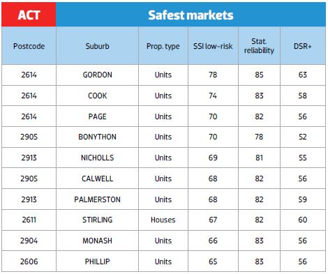
Since we’ll always have a government, you’d think Canberra would be a fairly safe market to invest in. But Canberra can have risk spikes, for example when a costcutting government obtains power and starts sacking excess staff.
Midge Point is in the Queensland Whitsundays about 70km north of Mackay. Being a touristy town it has taken a hammering. A low Aussie dollar, however, might improve its fortunes. But if I knew the direction of the Aussie dollar I wouldn’t be investing in property; I’d be a foreign exchange trader.
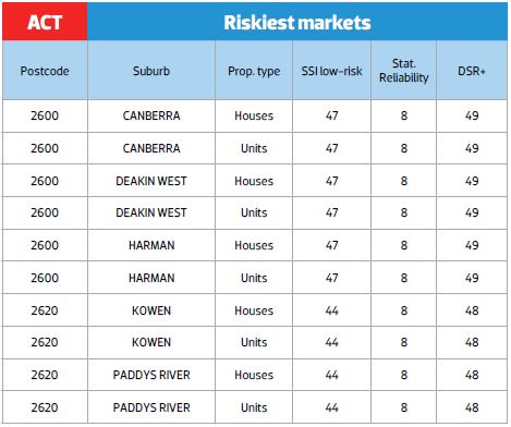
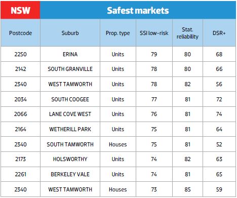
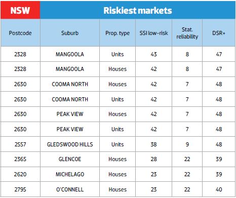
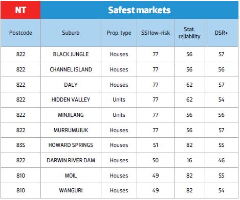
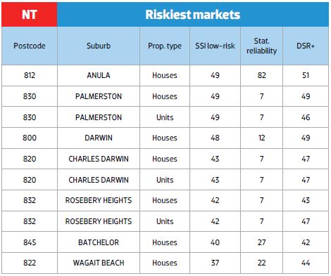
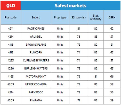
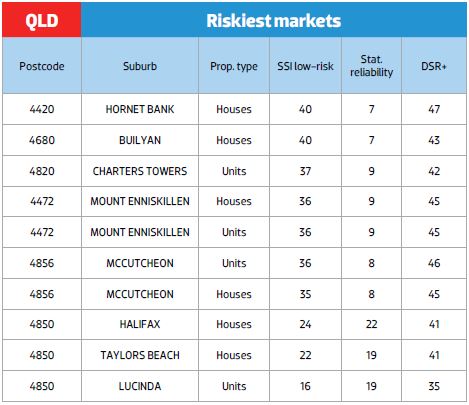
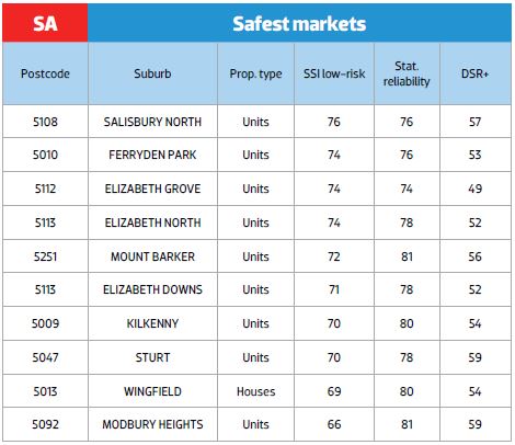
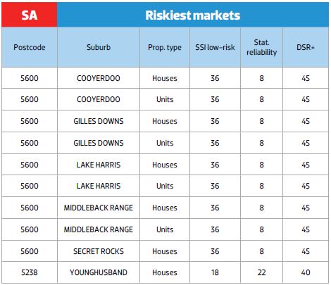
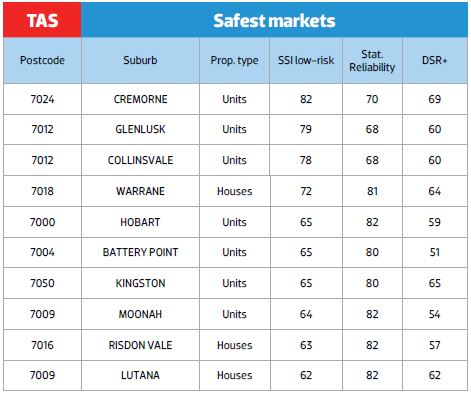
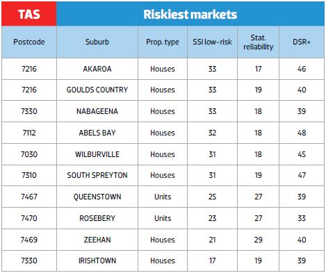
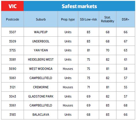
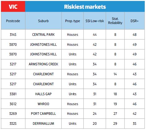
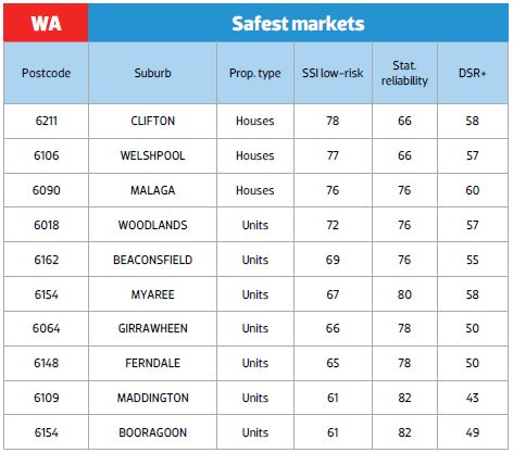
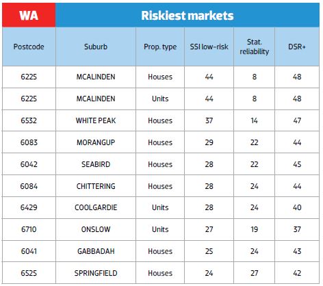
Safe and risky markets by state
Table 6 (opposite page) shows a list of the safest and riskiest markets for each state. If you familiarise yourself with these differences, you’ll be in a better position to identify a trouble spot by just glancing at the stats.
Table 6 – Safest and riskiest markets by state
Conclusion
There are many things that can go wrong when investing. There are a lot of topics to research. A stone left unturned is a potential problem. Gather as much information as possible to reduce risk.
If there are any statistics indicating something is not right, then you need to delve into it a little deeper or look for a better market. Not knowing enough about a market is your biggest risk.