In 2017, the Collins Dictionary word of the year was ‘fake news’, infamously heralded by then-US President Donald Trump. With real estate being Australia’s most popular asset class, some commentators find it easier to attract attention by engaging in polemics and alternative facts. Headlines such as ‘bricks and slaughter’ come to mind. With 2021 seeing record level property prices and borrowing, the usual suspects will no doubt shift the conversation to a housing bubble sooner or later. Today, we will unpack some of the most common claims surrounding the question of whether Australia is in the midst of a housing bubble.
The Australian housing market?
First of all, let’s get some perspective by defining the Australian housing market. Australia is one of the world’s most urbanised countries. So urbanised, in fact, that 40 percent of our entire population is squeezed into the greater cities of Sydney and Melbourne. To put this into perspective, 25 percent of Canadians live in either Toronto or Montreal, 21 percent of the UK live in London or Manchester, and just four percent of the US live in either New York City or Los Angeles.
Sydney and Melbourne aren’t just the most populous parts of the country. They are also the location of the greatest concentration of expensive homes. Although 40 percent of home sales in the past decade were in Sydney and Melbourne (according to ABS data), the cities contain an even higher proportion of the nation’s housing value. Think of it this way: Sydney’s median house price is almost double Perth’s. This means although Sydney has 2.3 times the number of homes Perth does, it has approximately 4.3 times the combined dwelling price.
How does this work mathematically? If Sydney’s median dwelling price fell by just one percent, Perth’s would have to increase by 4.31 percent to balance out the national figure (assuming for the purpose of this exercise that all other markets remain unchanged). If Perth grows instead by, say, 3.5 percent, then the headline story would be ‘national housing values drop’. Even though the only market which saw a decline in values was Sydney.
This hypothetical scenario has actually played out in different ways recently. After Sydney passed its peak in 2017, the total value of Australian dwelling stock began to decline despite the fact that regional Victoria, Brisbane and Hobart house prices were increasing. The same was taking place for attached dwellings in a number of markets.
Not all markets within a country act the same
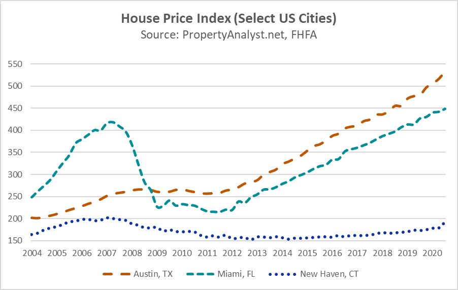
What we have discussed so far raises a clear issue with tarring an entire country with the same brush. This isn’t just a problem in Australia. Even during the most infamous property bubble in generations—the US subprime mortgage crisis—markets performed in contrast to one another. On one end of the spectrum, you have Miami. This market followed the narrative quite well. There, the house price index skyrocketed between 2004 and 2007, only to then plummet. Prices have since recovered and surpassed the peak of the bubble. New Haven (of Yale fame), however, endured nowhere near as heavy pre-GFC growth, yet still hasn’t fully recovered from the crisis. On the other end of the spectrum, Austin experienced little more than a speed hump during the crisis and has since outperformed the other two markets.
In the case of Australia, exponents of the housing bubble usually identify one or a combination of the following elements: growing levels of household debt, price-to-income ratios, price-to-rent ratios and price per square metre. Let’s unpack a couple of these in a bit more detail.
Household debt
According to OECD statistics, Australia has the fifth-highest level of household debt as a percentage of net disposable income of participating nations. We are behind Denmark, Norway, Netherlands and Switzerland. Not far behind us are South Korea, Luxembourg, Sweden and Canada. A number of these countries were featured in a 2020 report compiled by the RBA, exploring the various causes of growth in debt-to-income ratios. These include income growth, financial deregulation, interest rates, age structure of the population, as well as home ownership rates.
I have previously spoken about the relationship between financial deregulation, income and interest rates with respect to the future of the Sydney property market. In this article, I therefore want to look a little more at home ownership. This has been a hot topic in recent years, serving as the catalyst for the negative gearing debate during recent federal elections. The argument made by the Labor Party was that negative gearing made it more difficult for owner occupiers to compete in the marketplace, therefore applying downward pressure on home ownership rates. This argument doesn’t hold up to scrutiny. At PropertyAnalyst.net, I compare home ownership rates between a number of jurisdictions via an interactive chart. You will notice that a decreased proportion of private landlords is usually replaced by social housing rather than any noteworthy increase in home ownership. Aside from this, the rise in residential property investment funds is offering institutional investors the opportunity to circumvent these types of government policies—meaning yet again the losers are entry-level mum and dad property investors. Take the United Kingdom for instance, where home prices have recently reached record highs despite constraints applied to tax concessions of direct property investors.
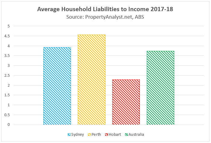
If we are to compare levels of household debt across Australian capitals, the differences between one another are greater than the difference between Australia and many other developed liberal economies. According to the ABS Survey of Income and Housing 2017-18, the average level of household liabilities was $270,800 in Perth. It was just $118,700 in Hobart. Since the differences in disposable income between the two cities is not equally as large, this results in a considerable disparity in the ratio (which you can see in the below chart). Lumping Perth and Hobart into the same broad commentary surrounding Australian household debt is next to meaningless from the perspective of a property investor or homeowner.
Housing affordability
It’s no secret dwelling prices in some parts of Australia have skyrocketed in recent years. In 2015 and 2016, historically working-class suburbs in Sydney’s west were edging past the $1 million median house price threshold and more people began asking whether Australian homes were unaffordable. The key international measure of housing affordability is known as the price-to-income ratio. This is a simple division of median dwelling price by median annual household income. If the median house price is six times the median annual household income, the price-to-income ratio of that area is six. The higher the price-to-income ratio, the less affordable housing is considered to be. Even though this seems to be a simple calculation, it is sorely misunderstood. This has led to the OECD committing to offer these statistics at a regional level from 2020 onward, with their reasoning being that significant variations exist between markets in the same country.
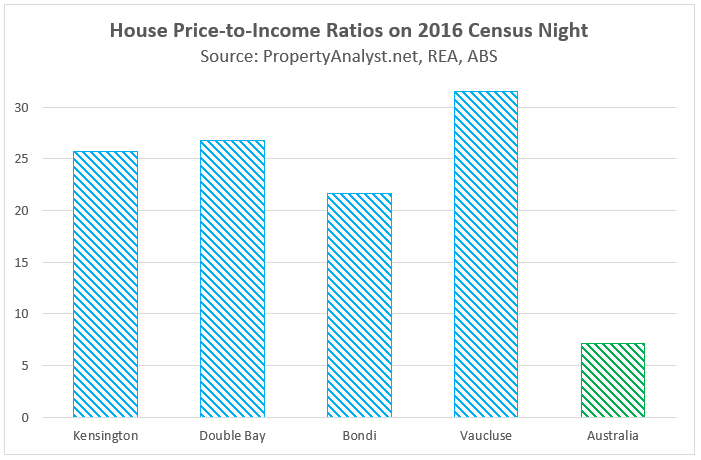
Australia is a classic case of price-to-income ratios varying considerably between suburbs, cities, and regional markets. For the purposes of this analysis, let’s compare neighbouring suburbs in Sydney’s east to the Australian house price-to-income ratio on census night 2016. Sydney’s east is an interesting area. It is known throughout the county as the home of Australia’s wealthy elite—boasting names such as Malcolm Turnbull, Justin Hemmes, the Kyle and Jackie-O duo, as well as (formerly) James Packer. However, it is also home to a littering of aspirational millennials, university students and backpackers. Despite the diversity, most suburbs in Sydney’s east boast some of the country’s most expensive and in-demand housing. In Vaucluse, you’d expect to part ways with upwards of $5 million to purchase the median house in that suburb. Back in 2016 during the most recent census, this figure was closer to $4.5 million. At that time, the suburb’s price-to-income ratio for houses was an eye watering 31.6 compared to Australia’s 7.2. For comparison, I’ve included a couple of nearby suburbs in the below chart.
What’s unique about the eastern suburbs is the significant levels of personal wealth inside some of those households, meaning that median income is not as effective as wealth distribution in determining housing affordability in this area. In addition, houses represent a considerable premium on apartments in these areas because of the stark contrasts between these two dwelling types (you’re not comparing a fibro cottage with an apartment, you’re comparing a mansion with an apartment). Occupants of each property type will differ substantially in income and wealth distribution. Just like the eastern suburbs, many other Australian streets, suburbs, regions and states contain unique characteristics which influence price-to-income ratios without it necessarily reflecting the affordability of homes.
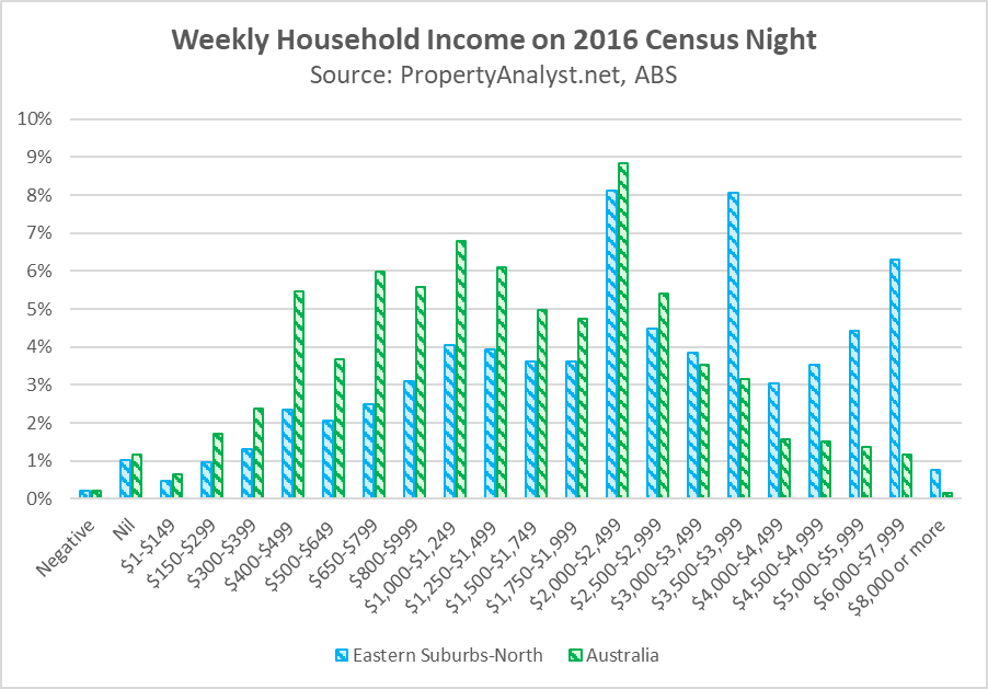
Sydney’s east serves as a cautionary tale of the limitations of house price-to-income ratios. After all, the median household is not buying the median house in many parts of Australia. In the case of Sydney’s east, almost half of all homes are rented and a quarter are owned with a mortgage. Despite sky high price-to-income ratios, mortgage stress was lower in this area than the national average. What do all these figures imply? The high variation in wealth and income in this area skews the house price-to-income ratio beyond anything meaningful.
So, is there an Australian housing bubble?
There are certainly some pockets of Australia which are pushing housing prices into bubble territory. For these markets, it’s likely they will experience a prolonged stagnation of price performance once further price growth catches up with discounted mortgage interest rates. Areas I’m particularly concerned about are highly leveraged middle-to-lower income neighbourhoods which are sensitive to any mortgage interest rate increases throughout the life of their loan. A number of these are inside Greater Sydney. When it comes to everywhere else, keep in mind that it likely differs from the national figures you hear about online and in the news.
In summary, instead of thinking about an Australian housing bubble per se, we should be thinking about specific areas where it’s unwise to buy on the basis of exposure to potential future economic events such as changes to income, employment, demographics, as well as access to credit. As an investor, you can mitigate this by checking the level of mortgage stress in the area and determining whether the local demographic could cope with mortgage interest rates returning to historical averages in the medium-to-long term.
Luke J. Graham is a property market and behavioural analyst currently completing research and postgraduate study in these disciplines at the University of Oxford. Recently, this has included work on housing affordability in major cities, the future of automated valuation models, as well as the behavioural economics of ecologically sustainable housing. He is a consultant to business leaders and property entrepreneurs in both Australia and abroad via his platform PropertyAnalyst.net.